Creating a Survey
Step 1: Initiating a New Survey from Scratch or using a Survey Template
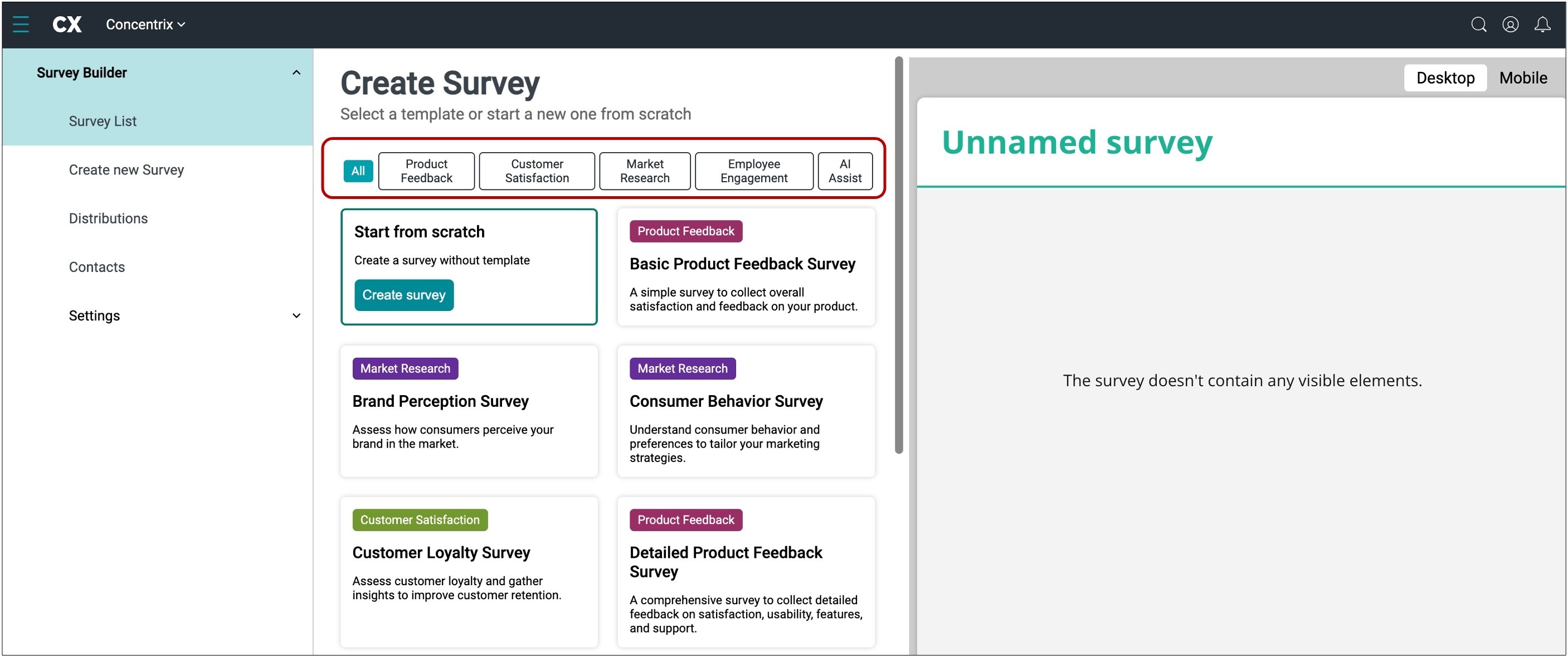
The Survey Builder offers pre-made templates ready to customize for your questions. If you prefer to create a survey from scratch, hover over the top left of your screen and select the ‘Start from scratch’, and click the Create survey button. Additionally, the tool features an AI Assist option. Just input a topic, and the AI will suggest relevant survey questions for your questionnaire.
Step 2: Adding Questions
Once you’re in the scratch survey builder, you can choose the type of question you want to create. By clicking the ‘Add Question’ tab in the center of your screen, you will automatically choose the ‘Radio Button Group’ template. The Radio Button Group is a multiple-choice question. To choose a different type of question, go to the toolbox on the left of your screen to find the appropriate survey question template, or use the ellipsis icon on the right for a shortcut to select the question type.
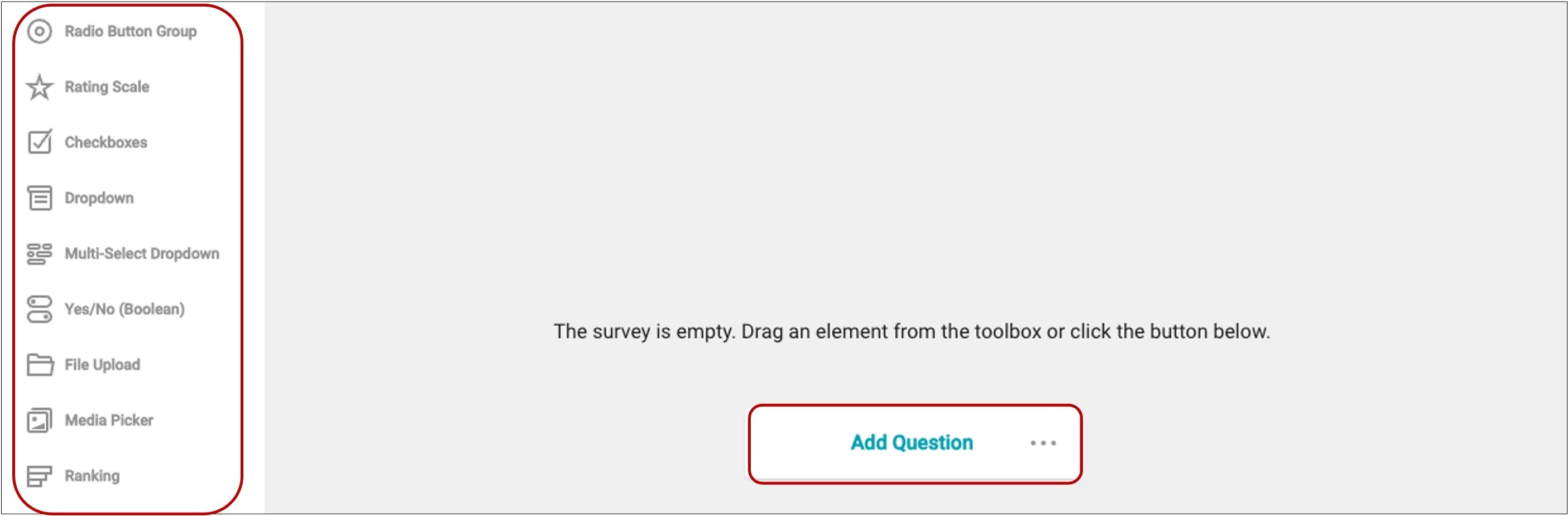
Please refer to the Appendix for a list and descriptions of the different types of questions.
Step 3: Customizing Survey Appearance
To customize the applied UI theme of your survey by changing colors, sizes, fonts, shadow effects, and other survey appearance parameters in a user-friendly interface, navigate to the top of your screen and select the ‘Themes’ Module.
Once in the Themes tab, your Theme Settings panel will open automatically and appear on the right side of your screen. Here, you will have these choices of customizations:
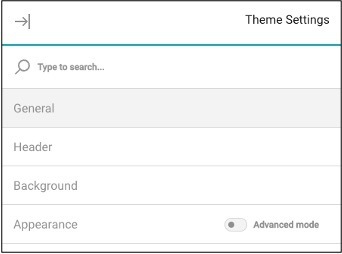
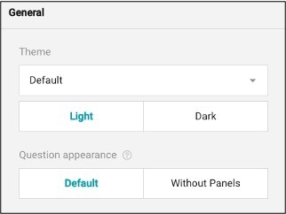
- General
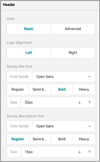
- Header
- Background
- Appearance
The General Dropdown Tab allows you to create the overall theme for your survey. Use the dropdown menu to adjust the theme, where you can select from light (the default) or dark themes. Additionally, you can use the last option on the General tab to modify the appearance of questions, choosing to frame them in a panel or display them without a panel.
To customize the header of your survey, navigate to the Header Dropdown Tab within your Theme Settings. To create a larger header, switch the view from basic to advanced. In the advanced view, you can adjust the header size by utilizing the arrow icons. The down arrow makes the header area smaller, while the up arrow creates a larger header. You can also adjust the width by modifying the content area width.
In this section, you can also customize your logo. If you haven’t put a logo in your header navigate to the Survey Property instructions for further information on how to do this. The background color refers to the color of the header. To adjust the color, utilize the custom tab and the color dropper to choose the customized color. Alternatively, you can use a background image instead of a color. To upload an image, click the folder icon to browse your files, and choose how you wish to display the image. To adjust the survey title and description font, use this section to customize the font, color, and size.
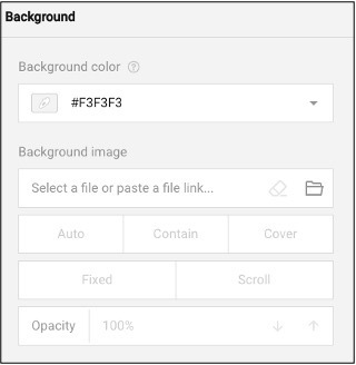
To adjust the background appearance, utilize the Background Dropdown Tab. You can change the background color by selecting a default color from the dropdown menu or by using the dropper icon for a custom color. If you prefer to use an image as your background, you can upload it here. Once uploaded, you can choose whether the image remains fixed in one spot or scrolls with the survey respondents. If the image is too distracting, you can adjust the opacity to reduce its saturation.
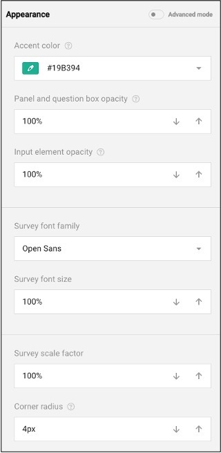
The Appearance Dropdown Tab lets you enhance the look and feel of your survey by customizing the accent color, background, and question panel. To make changes, use the color dropper to adjust both the color and opacity settings.
Step 4: Setting Survey Properties
Survey Property
The Survey Property allows you to customize the overall look and feel of the survey. Make sure you have your cursor selected within the survey title then navigate to the top right of your screen and select the ‘Survey Setting’ icon. This will reveal the panel that provides access to the survey properties:
- General
- Quota
- Logo In Survey Header
- Navigation
- Question Settings
- Pages
- Conditions
- Data
- Validation
- ‘Thank You’ Page
- Quiz Mode
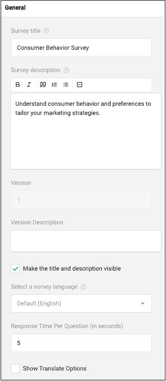
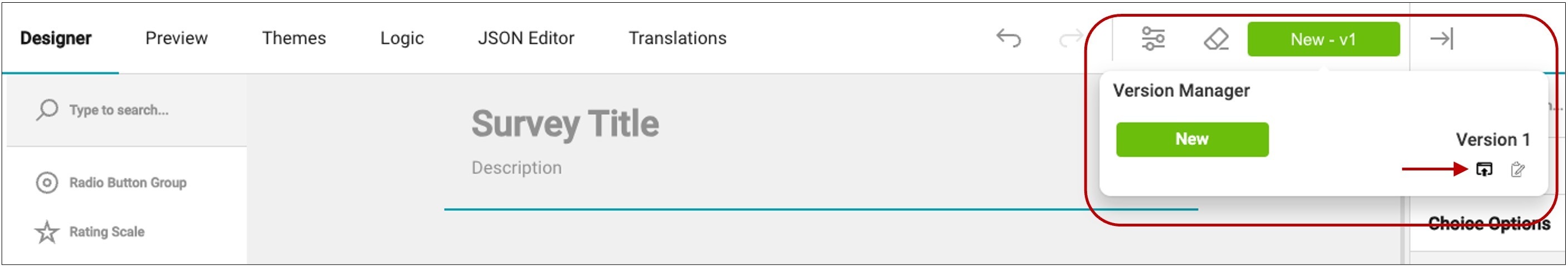
To edit each of these sections, select the tab you wish to edit, and a drop down will appear. In the General Tab, you will be able to add edit the overall survey settings like the title and description of the survey. You can make this visible to the respondent by checking the box below the version description. The version description helps identify the specific version of the survey if multiple versions exist.
Additionally, you can choose the language in which the survey will be displayed. If you want to make the survey translatable, select "Show Translate Options" to choose the type of translation needed for the survey.
The survey can be utilized by respondents in two-ways:
- Read-only: which only allows the respondents to see the questions but not interact.
- Editable: which allows your respondents to interact and respond with the survey questions.
To restrict respondents to taking the survey only once, use the "Limit to one response" tool. This feature assigns a unique cookie value to your survey, which is set in a respondent’s browser upon survey completion to prevent multiple submissions.
To update the survey width mode, adjust the survey mode from auto, which is a combination of the two question types:
- Static: This is a fixed width.
- Responsive: The survey will occupy the full width of the screen.
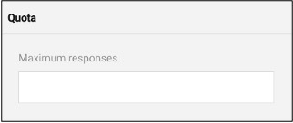
The Quota Tab allows you to set a maximum number of completed surveys. Once this number has been reached, the survey will no longer accept additional submissions.
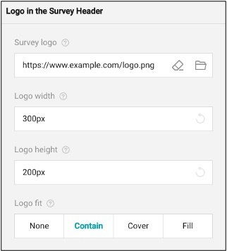
The Logo in the Header Tab feature allows users to upload their own logo, enhancing branding and personalization. It provides guidance on the prescribed width and height for the logo to ensure optimal display. Additionally, it includes options for the layout and positioning of the logo within the survey, ensuring it integrates seamlessly into the survey's design. To place an image in the header for a logo, utilize the ‘Logo in the Survey Header’ dropdown. Here you can select the file icon to upload an image for your logo. You can delete the image but selecting the eraser tool.
To modify the image size, use the logo width and height tool to adjust the fit. You may also apply the logo fit which applies your image in these ways:
- None: Image remains the original size
- Contain: Image is resized to fit while maintaining aspect ratio.
- Cover: Image fills the entire box while maintaining aspect ratio.
- Fill: image is stretched to fill box without maintaining aspect ratio.
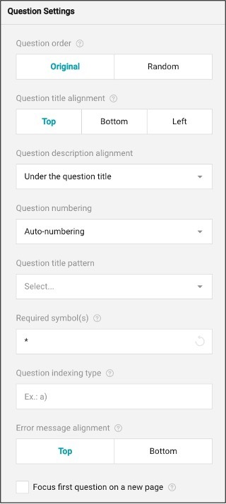
The Question Settings section manages the overall organization of your questions. You can find further question details in the Question Property panel.
To maintain the order of questions as they were created, select the ‘Original’ button under the question order. For random question order, choose ‘Random’.
The questions can appear for the respondents at the top, bottom, or left aligned. You may change your question title alignment by selecting these buttons.
The question description can be displayed either below the title or at the bottom of the question pane. If you select "under the title," the description will always appear directly beneath it. Choosing "under the input field" will position the description following the answer choices.
To enable question numbering, use the ‘Question numbering’ dropdown. This dropdown allows you to choose numbered questions, reset when on a new page, or no numbering at all.
To adjust the style in which your bullets are displayed, refer to the ‘Question title pattern.’
To indicate that there is a required step, use the ‘Required symbol(s)’ option to indicate to your respondents that this item is required. By typing a symbol in this blank, respondents will not be able to advance in the survey unless completing the step.
To use another type of numbering system, utilize the ‘Question indexing type’ to adjust your numbers to letters or patterns.
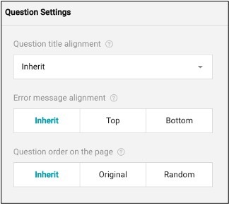
If an error message has to appear, use the error message alignment to indicate where the error message should appear for the respondents.
Finally, to restrict the length of answers or comments, use the boxes provided to set the maximum length allowed.
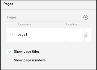
The Pages Tab allows for the editing and customization of page names and titles. It also provides the option to show or hide page titles and page numbers, giving users flexibility in how the survey is presented to respondents. This feature helps in organizing the survey content clearly and enhancing the respondent's navigation experience.
To add additional pages, navigate to the top right of the panel and select the ‘+’ icon. This will add additional pages. To delete a page, select the trash can icon aligned with the page you wish to erase. To edit a page name or title select the page number you wish to edit and then type the text you want to display.
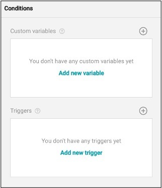
The survey Conditions Tab allows the surveyor to create variables and triggers based on the respondents' input. The variables serve as intermediate or auxiliary variables used in form calculations. They take the respondent's input as a source value. Each custom variable has a unique name and an expression it's based on. The trigger is an event or condition that is based on an expression. Once the expression is valued to be “true” a trigger sets off an action. Such an action can optionally have a target question it affects.
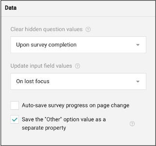
The Data Tab is an advanced setting designed for linking and syncing values in the database for storage. It allows the survey tool to manage and clear hidden question values, update input field values, and automatically save survey progress.
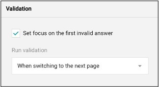
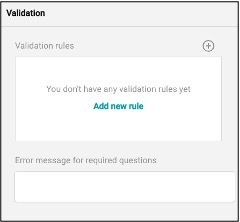
The Validation Tab creates rules (expressions) that will trigger an "error message" if respondents do not fill out all required form fields or the format of values is incorrect before submission. It validates user responses immediately after an answer is entered or when respondents move to the next page or end the survey.
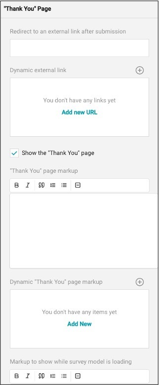
The Thank You Page Tab feature enhances the post-submission experience for respondents. After submitting the survey, respondents can be redirected to an external link or shown a customized thank you page with a personalized message.
This feature also allows you to display a notification indicating if a respondent has already filled out or completed the survey, ensuring clear communication and a smooth conclusion to the survey process. If you would like to provide a thank you to your survey respondents, use the “thank you” page dropdown.
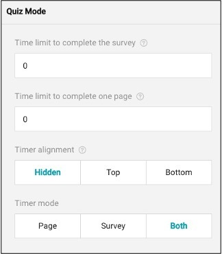
A survey tool is designed to improve the survey experience by introducing a time limit for completing the entire survey or each individual page. This feature includes the ability to set and display a countdown timer that can be strategically placed within the survey layout to keep respondents aware of the remaining time. This helps maintain focus and encourages timely completion of the survey
Page Property
The Page Property feature allows you to customize various details of a survey page.
To access the Page Property panel, navigate to the page you wish to customize and select within the page. The page will be highlighted once selected. Once the page is selected make sure your property panel is open. To open the property panel, navigate to the top right of your screen and select the icon with the arrow points to the line. Once in the page property panel, you will be able to customize the following:
- General
- Question Settings
- Conditions
- Navigation
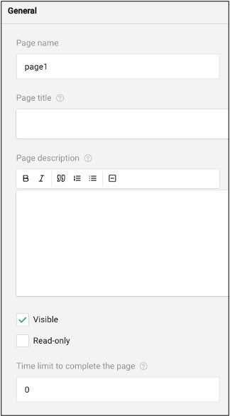
In the General Tab, you can create a page name, title, and description, which can either be visible to respondents or hidden using the read-only options. Additionally, you can set a time limit for completing the page within this tab.
The Question Settings Tab allows you to organize and align the questions on the page. The question title alignment can be set to left, top, bottom, inherit, or hidden, and applies to all questions on that page. You can also set the alignment for any error messages within this tab.
If you would like to create a specific order for your question on the page, you can also create that here.
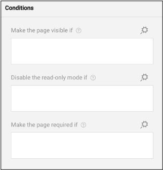
The Conditions Tab feature controls the flow of the survey based on respondents' answers.
This allows questions to be set as visible, read-only, required, reset value, or set value if the criteria or rules (expressions) are met. It also includes Skip Logic, which directs respondents to different questions or sections based on their input.
Instead of displaying all questions or options at once, display logic enables the form content to adapt in real-time according to the user's input and show only relevant information. This makes the form more user-friendly and helps respondents complete it more efficiently.
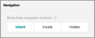
The Navigation Tab includes essential elements for a well-organized survey layout, such as an aligned progress bar to show completion status and buttons for navigating between previous and next pages, as well as a ‘Complete Survey’ button to allow easy movement through the survey. These navigation buttons are located at the bottom of the page.
You can customize the visibility of these buttons by choosing to make them hidden, visible, or inherit, depending on how you wish to structure the survey experience.
Question Property
Depending on the question type you have selected, the options in the Question Property may vary. To access the Question Property, navigate and select the question you wish to customize, then expand the property panel at the top right of your screen.
In the Question Property Panel, you can customize the following options:
- General
- Choice Options
- Question Settings
- Choices from a web service
- Layout
- Conditions
- Data
- Validation
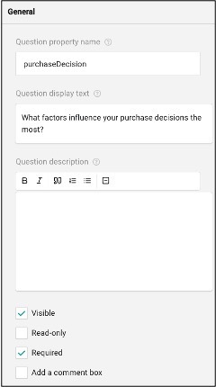
In the General Tab, you can edit the property name. The property name is only visible to the survey creator, not the respondents. Below the property name, you can edit the display text. The display text is where your question will be entered.
As a survey creator, you can create a question description if the respondents need additional information. Within this subsection, you can make this visible to your respondents, which allows them to be able to see the additional information. If the surveyor selects the ‘Read-only’ option, the respondents are not able to interact with the survey question.
You can mark the question as required or mandatory. Respondents won't be able to proceed to the next section unless they've answered it.
Lastly, you may create a comment box if the question requires a free-text response, you can enable a comment box for open-ended answers.
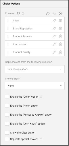
In the Choice Options Tab, you can fully customize the answers provided to the respondents. By selecting the answers listed, you can easily reorder them into your preferred arrangement by dragging them. If you need to modify any of the answers, simply click the pencil icon next to the answer you'd like to edit.
To add additional answers, click the ‘+’ icon located at the top right of the screen. For a more automated approach, you can use the AI- generated answers feature, by selecting the wand icon in the choice detail panel. This will prompt the AI to create answers corresponding to your question. You can generate new responses by selecting the tool again if necessary. If you need to remove all answer choices at once, you can click the eraser icon at the top right.
Additionally, you can select the order of how your answers are displayed, with options like ascending, descending, random, or no order. If you want to reuse answers from another question, you can select the "Copy from another question" dropdown to populate those responses.
In this section, there are templatized answers as well that you can enable such as “None, Refuse to Answer, Other and Don’t Know.” providing more flexibility and inclusivity for respondents.
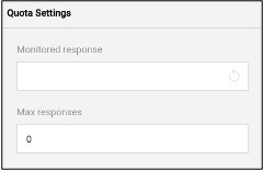
The next tab is the Question Settings Tab which allows you to monitor survey quotas. As the surveyor, you may put one of your answers in the monitored response. Once an answer is marked as monitored, you can set a maximum number of responses for that option. When the respondent reaches this limit, the survey will reach its quota, and the respondents will no longer be able to answer the question.
The maximum responses feature allows the survey to conclude when the predefined response limit is reached, stopping the collection of additional responses after the quota has been fulfilled.
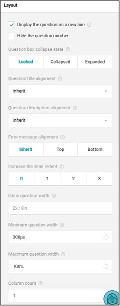
In the Layout tab, you can customize the way each question appears. This section allows you to adjust how each question is displayed, aligned, and indented relative to the rest of the survey.
You can use the dropdown menu to move questions between different pages within your survey, facilitating easy reorganization. By default, questions are displayed on separate lines.
However, if you prefer to have your questions aligned on the same line, you can deselect the option to "display the question on a new line." Additionally, you can use the checkboxes to hide question numbers, further tailoring the layout to fit your survey's design and readability needs.
In this section, you can choose how you wish to display the question box. You have three options:
- Locked: The questions box is displayed in full and cannot be collapsed
- Collapsed: The question box initially displays only the title and description, but can be expanded by respondents
- Expanded: The question box is displayed in full and cannot collapse.
To edit the alignment of the question title and description, use the inherit dropdown menu. You can choose from several options: inherit, top, bottom, left, or hidden
Here, you can also assign where you would like an error message to be displayed. To adjust the inner indent of the question box, use the number settings (0-3) to add space or margin between the question content and the left border of the question box. This helps in fine-tuning the layout for better visual clarity and alignment.
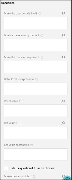
The Conditions Tab is used to manage questions that have conditional logic. If a respondent answers a question in a specific way, this tab allows you to set conditions under which certain items or questions will appear based on their responses.
This feature enables you to create dynamic surveys where the content adapts to the respondent's answers, ensuring that only relevant questions are shown based on the provided input.
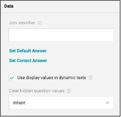
The Data Tab allows the surveyor to create a join identifier which is a custom key that you can assign to several questions to link them together and sync their values. These values are then merged into a single array of objects and stored in the survey results using the key as the property name.
Here, is also where you can choose which answer would be correct. To choose a correct answer navigate to the middle of the section a select ‘Set Correct Answer’. This will allow you to choose the answer you want the respondent to choose as the answer.
The inline question width setting refers to the width of the question in proportion to other survey elements. You can set both the minimum and maximum width for your question by typing in the sizing.
The Validation Tab allows you to create an error message for the survey. Error message if needed. These messages help ensure that respondents correct any issues before submitting their responses, maintaining the quality and accuracy of the data collected.
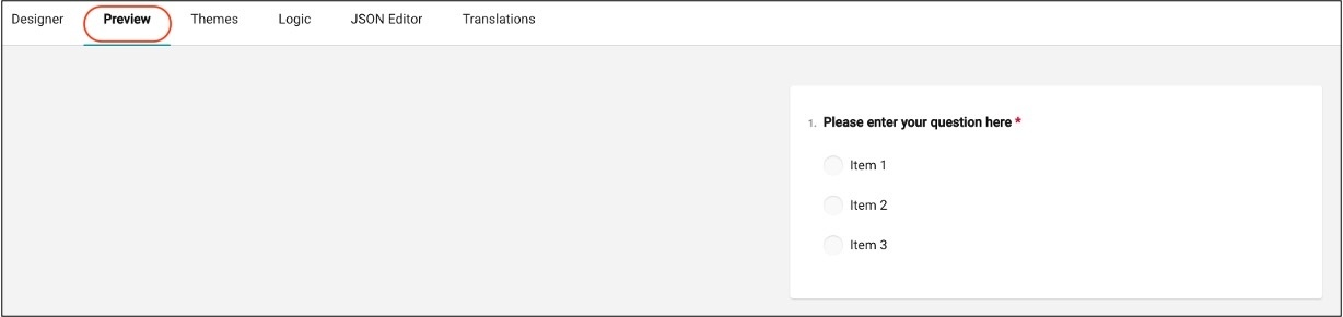
Step 5: Previewing the Survey
To preview the survey before publishing, navigate to the top left of your screen and select the Preview Module. Once you are in the preview mode, you will be able to see the survey from the respondent’s perspective.
To exit the survey mode and return to editing, navigate back to and select the Designer Module.
Step 6: Saving and Publishing the Survey
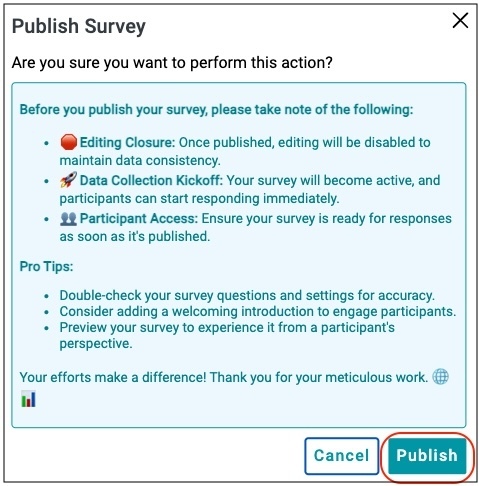
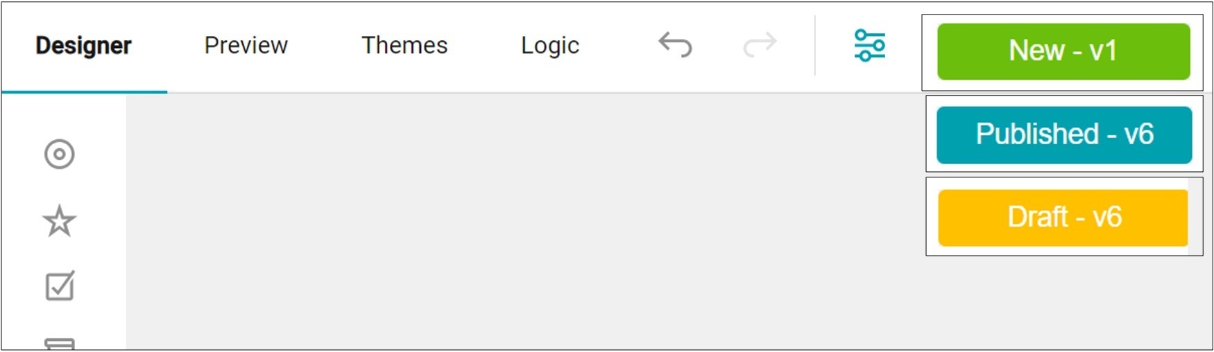
To publish your survey, navigate to the survey status at the top right of your screen. The current status should be yellow for draft, or green for new.
Click the survey status button and navigate to the bottom right of your screen. Select the publish survey icon. By selecting the publish survey icon, you will be prompted to a modal window to review the survey for accuracy and clarity. If you are ready to proceed, click the Publish button.
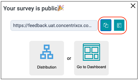
When you click the publish button, a modal window will appear. To share the survey link, select the duplicate page icon to copy it and paste it wherever needed. Alternatively, you can use the icon next to the duplicate page icon to open the survey link directly.
If you'd like to send the survey to a contact group, simply click the ‘Distribution’ button (refer to the Distribution process for more details). The ‘Go to Dashboard’ button will take you to a page where you can view the results of ongoing surveys.
You will notice on the upper right of your screen, that the status of your survey will automatically change from New to Published.

Survey Status
To determine the status of your survey, check the top right of the screen. The colors will indicate the following statuses:
- Green: A new survey has been created
- Blue: The survey is published and cannot be edited unless switched to draft mode.
- Yellow: The survey is in draft mode and can be edited or updated.
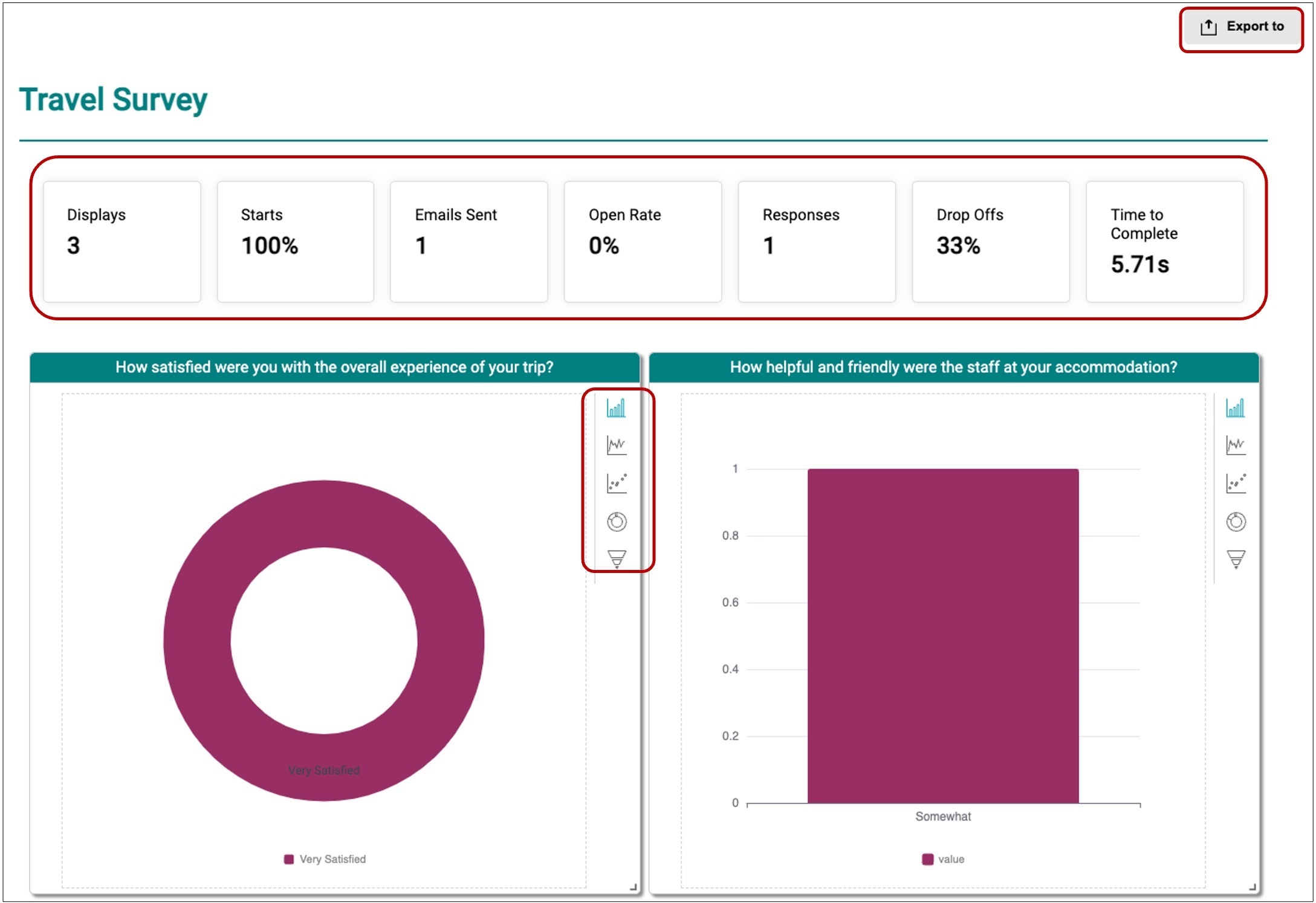
Step 7: Analyzing Survey Results using Dashboard
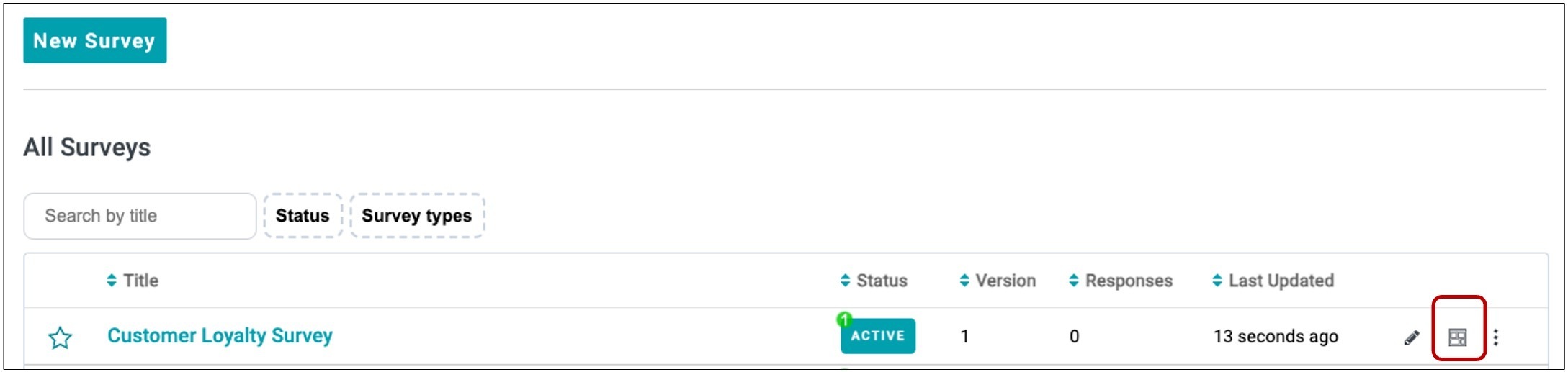
To view the results of the survey, go to the survey and click the Dashboard Icon. Upon accessing the survey dashboard report, a comprehensive view that tracks the progress of survey responses using various survey metrics and presents a visualization of the survey results.
The following are the survey metrics that can be used to monitor and measure the progress of an on-going survey.
- Displays - refer to the number of times the survey was opened or viewed by survey recipients.
- Starts - indicate the number of survey respondents who began the process of providing answers in the survey.
- Emails Sent - refer to the total number of emails sent or distributed to survey recipients inviting them to participate in the survey. This helps tracks the reach of the survey distribution via email.
- Open Rate - percentage of survey recipients who opened the email containing the survey invitation
- Responses - refer to the number of completed surveys submitted by the survey respondents.
- Drop Offs - percentage of survey respondents who started the survey but did not complete it. This helps identify the points in the survey where respondents disengaged or abandoned the process.
- Time to Complete - average amount of time respondents took to finish the survey. Provides insights into how long it took to answer all questions, which can help assess the survey’s complexity or respondent engagement.
The dashboard includes charts that visualize the survey results. You can switch between different chart types by clicking the icons in the upper right corner of each chart, and you can also export the data as CSV or XLS files.