Survey Creation and Distribution
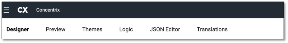
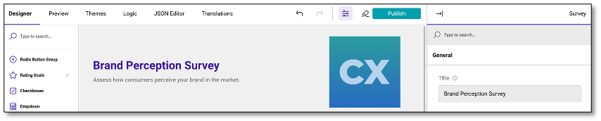
The Survey Creation and Distribution documentation offers a guide to designing, configuring, and deploying surveys effectively using the DIY Survey modules --- Designer, Preview, Themes, and Translations. These modules are designed to assist users in navigating the entire process, from survey creation to distribution.
-
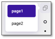
Designer - Build and structure your survey with an intuitive drag-and-drop interface. Add, edit, and organize questions, sections, and elements to create a logical and engaging survey flow. Quickly navigate and jump between pages using the page icon located on the right side of the screen.
-
Preview - Test and visualize the survey from a respondent's perspective to ensure proper layout, logic, and overall user experience before publishing. User can use the page buttons at the bottom to move through the survey, rather than answering individual questions. This will let users move ahead quickly to see questions in preview mode without having to answer each individual question

-
Themes - Customize the survey's appearance with pre-built themes or tailor fonts, colors, and styles to align with your brand guidelines.
-
Logic - Allows you to create rules that control the flow of your survey based on respondent inputs. By applying logic, you can design more dynamic and personalized surveys, ensuring respondents see only the most relevant questions or paths.
-
JSON Editor - Provides direct access to the survey's underlying JSON structure, giving advanced users full control over survey configuration and customization.
-
Translations - Manage multiple language versions of your survey to accommodate a diverse audience, ensuring accessibility for respondents in their preferred language.
NOTE: If the modules (Themes, Logic, Translations, etc.) are not visible due to limited screen space, use the browser scroll to navigate to the header at the top.
Initiating a New Survey from Scratch or Using a Survey Template
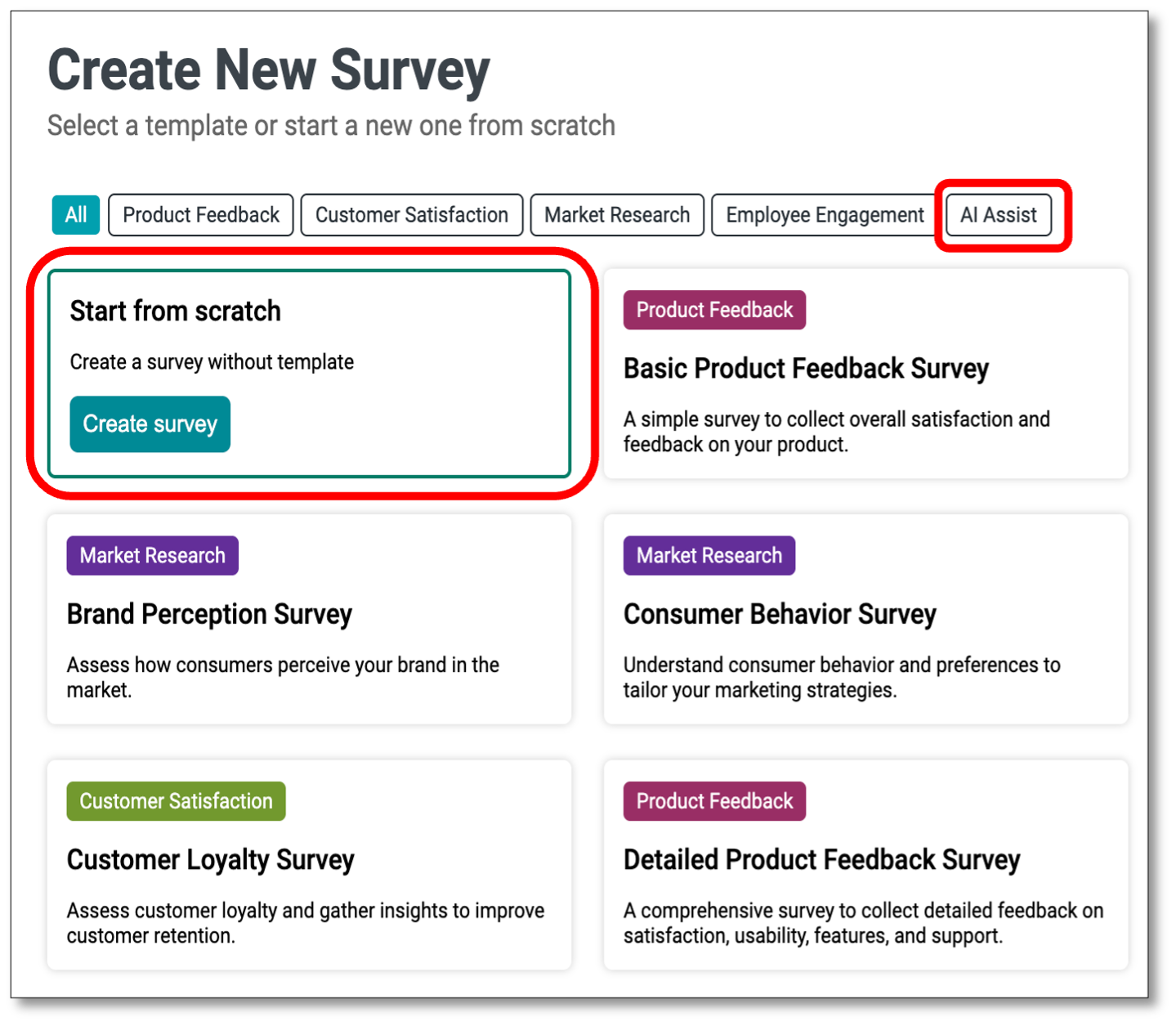
A survey can be created from scratch, by selecting a template survey, or by using AI Assist to suggest questions.

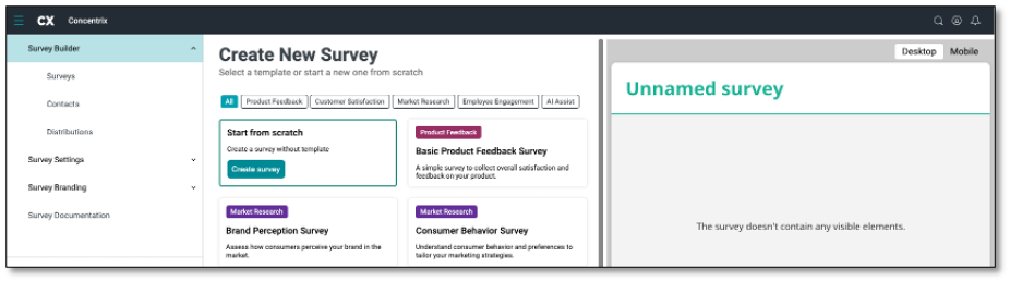
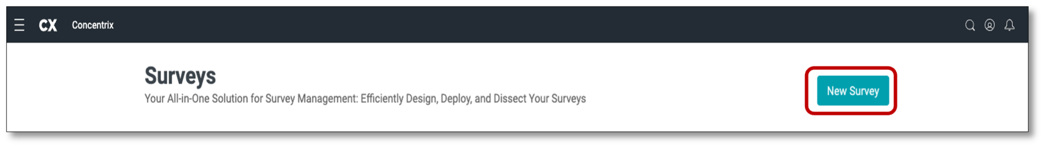
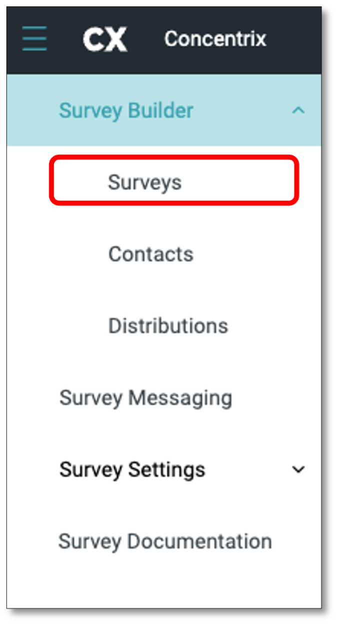
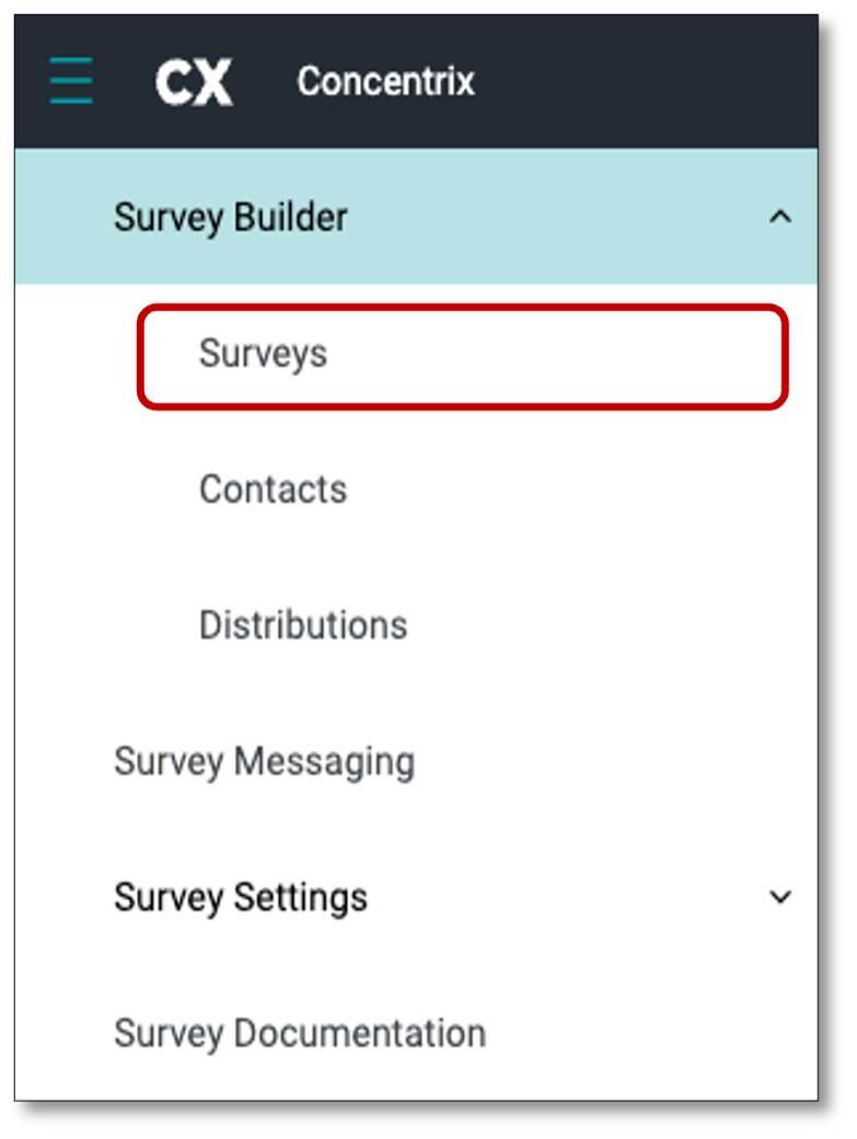
To create a survey by scratch, you must login to your Survey Builder with your account logins. Once in the Survey Builder, navigate to the top left of your screen and select the Menu icon and select 'Surveys' from the drop-down.Once in your surveys, select the tab at the top right of your screen 'New Survey'.
The Survey Builder offers pre-made templates ready to customize for your questions. If you prefer to create a survey from scratch, hover over the top left of your screen and select 'Start from scratch'. Additionally, the tool features an AI Assist option. Just input a topic, and the AI will suggest relevant survey questions for your questionnaire. Now that you are in the create a new survey homepage, navigate to the first option of creating from scratch and select 'Create Survey'.
When you choose to create a survey, a modal window will prompt you to enter a Survey Name. The name you provide will be consistently used across the platform, including the Designer Page, Survey List Page, Dashboard Report Page, and Export to File. This ensures continuity throughout the survey lifecycle.
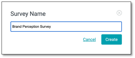
Next, after you have typed a name for the survey, select > 'Create'.
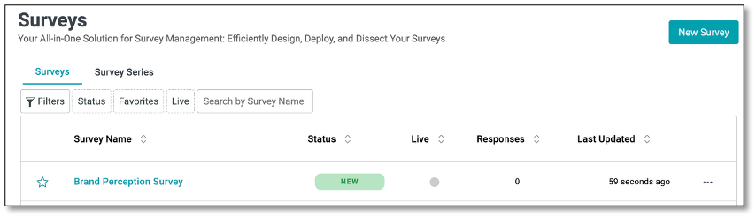
The Survey Name you enter at the start will be retained and automatically carried over across the different pages in the DIY Survey, as follows:
Designer Page
Survey List Page
Dashboard Page
Export to File
Adding Questions
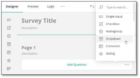
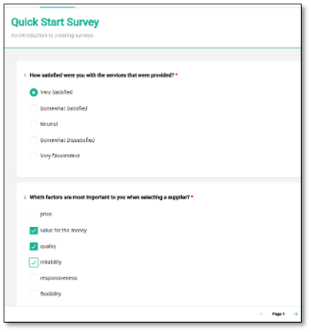
You have two options to add a question. You can Drag and drop the desired question type from the Toolbox onto the design surface. Alternatively, you can click the Add Question button to add a question. This button also displays an ellipsis icon that allows you to change the type of inserted questions.
In the Designer pager, you can select the type of question you want to create. Clicking the 'Add Question' tab at the center of your screen will automatically insert a 'Radio Button Group' question by default.
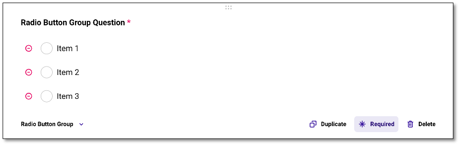
The Radio Button Group is a multiple-choice question. To add or choose a different type of question, go to the toolbox on the left of your screen to find the appropriate survey question template, or use the ellipsis icon (the three horizontal dots) on the right for a shortcut to select the question type.
If you wish to add a question to a new page, drag and drop it to the desired location on the page.
NOTE: For every question you add, you'll see that the 'Required' option at the bottom of the question panel is highlighted by default---indicating that the question is mandatory. If you prefer a question to be optional (such as an open-ended question), simply click on 'Required' to unhighlight it and make the question non-mandatory. The 'Duplicate' icon allows you to quickly duplicate the question, making it easier to reuse question formats without starting from scratch.
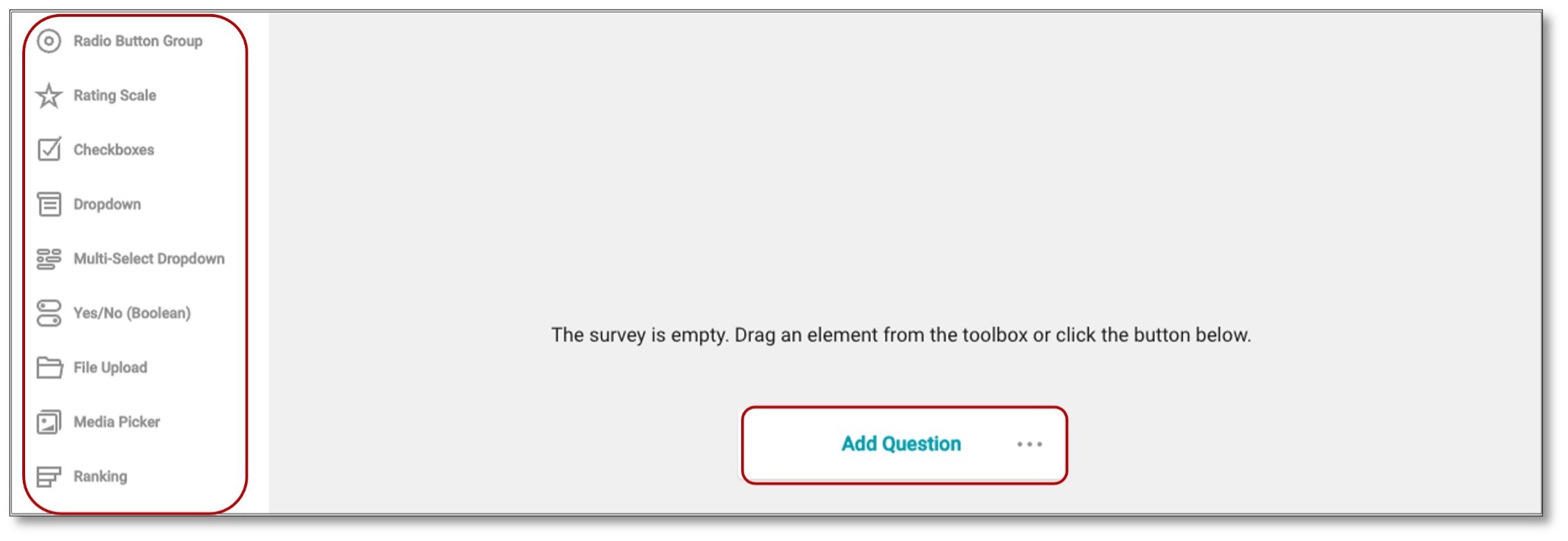
NOTE: Please refer to the Appendix for a list and descriptions of the different types of questions.
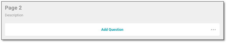
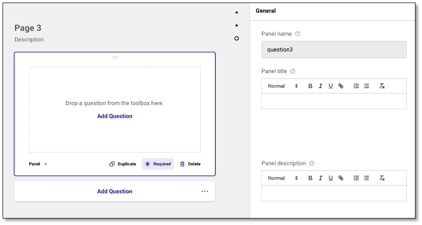
Adding a Page to the Survey
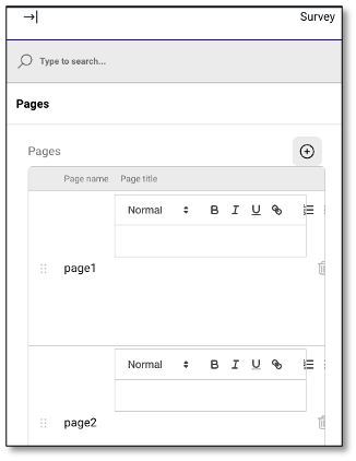
Under Property Grid, select Survey, expand the Pages category, and click the Add New button in the Pages editor:
Alternatively, you can add a page on the design surface. The surface displays the skeleton of a new page at the bottom.
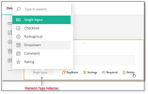
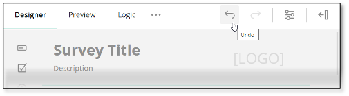
Changing the Question Type
Use the element type selector in the question. Some question types are non-interchangeable. For example, a Dropdown question supports choices, while Text or Long text does not. If you switch the question type from Dropdown to Text, your choices will be lost. In this case, you can click the Undo button to reinstate the previous configuration:
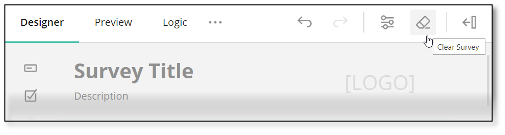
Clearing or Deleting a Survey
Click the Clear Survey button on the Toolbar:
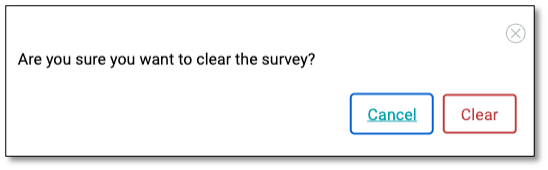
When deleting or clearing a survey, a confirmation prompt will appear to help prevent accidental data loss.
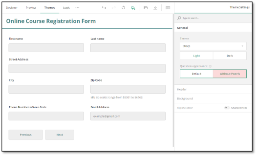
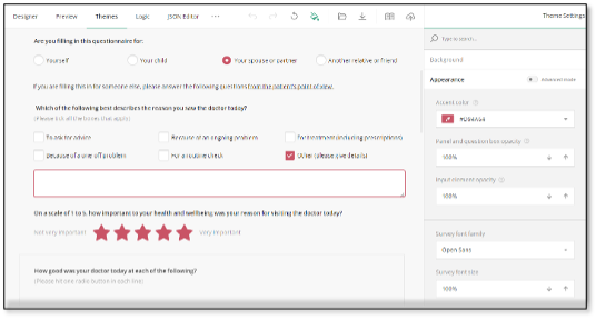
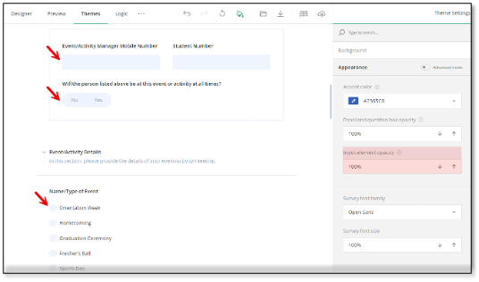
Customizing Survey Appearance
To personalize your survey's appearance, including colors, font styles, sizes, shadow effects, and other visual elements, go to the top of your screen and click on the 'Themes' module. This opens a user-friendly interface for customizing the UI theme.
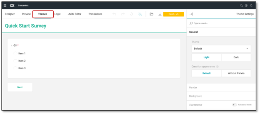
Once in the Themes tab, your Theme Settings panel will open automatically and appear on the right side of your screen. Here, you will have these choices of customizations:
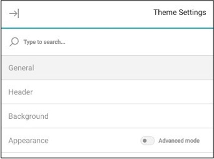
- General
- Header
- Background
- Appearance
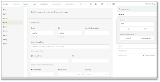
The General Dropdown tab allows you to create the overall theme for your survey. Use the dropdown menu to adjust the theme, where you can select from light (the default) or dark themes. Additionally, you can use the last option on the General tab to modify the appearance of questions, choosing to frame them in a panel or display them without a panel.
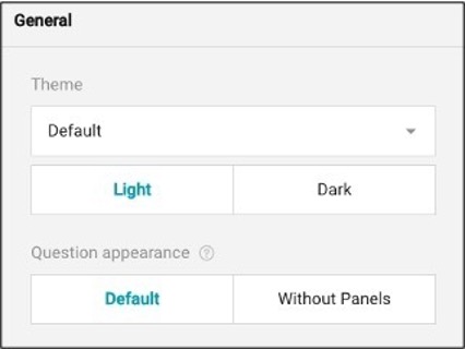
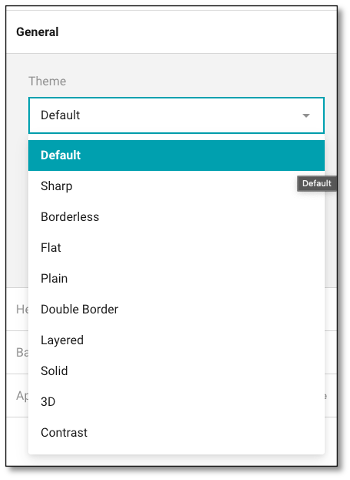
You can also apply a new theme, locate the Theme drop-down menu under the General category and select a theme from this menu:
Display Questions Without Question Boxes
In Survey Designer, every survey element includes an input field and a question box, an area that frames the question content and separates it from the survey background.
The Theme Editor allows you to remove the question boxes for the questions that are not nested within a panel, resulting in a lighter and more compact overall appearance.
To display questions without their individual question boxes, locate the Question appearance setting under the General category and toggle it to Without Panels:
NOTE: The Survey Designer offers an element called a panel (or a section) that allows you to group several questions together and modify their settings all at once. When questions are grouped within a panel, they don't have individual question boxes. The Question appearance setting doesn't apply to such nested questions.
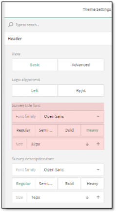
To customize the header of your survey, navigate to the Header Dropdown tab within your Theme module. You have two levels of customization for your survey header. By default, you have access to basic settings that allow you to make minor adjustments to the logo, form title, and description. For more detailed styling options, you can enable the advanced mode that allows you to fine-tune the design of the survey header with greater precision.
Style the Survey Header
The Theme Editor provides two levels of customization for your survey header. By default, you have access to basic settings that allow you to make minor adjustments to the logo, form title, and description. For more detailed styling options, you can enable the advanced mode that allows you to fine-tune the design of the survey header with greater precision.
Add a Logo
To add and configure your company logo in the survey header, follow these steps:
-
Switch to the Designer module.
-
Under the Logo in the Survey Header category, locate the Logo property.
-
Paste a link to the image in the input field or click the Folder icon next to the property to upload a file.
-
Optionally, resize the logo by entering the desired dimensions in CSS units (px, %, in, pt, etc.) in the Logo width and Logo height input fields.
-
Select the Logo fit option: - None - Image maintains its original size. - Contain - Image is resized to fit while maintaining its aspect ratio. - Cover - Image fills the entire box while maintaining its aspect ratio. - Fill - Image is stretched to fill the box without maintaining its aspect ratio.
NOTE: The system accepts the following file formats for upload - > JPEG, WEBP, PNG, HEIC, and BMP. There are no restrictions on the file size.
-
Switch to the Themes tab.
-
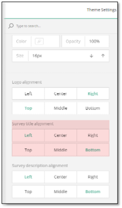
Under Header, locate the Logo alignment property and select between Left and Right (default) to set the logo position in the header.
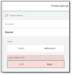
If you wish to center the logo or align it vertically, you can enable additional logo alignment options by switching to the advanced header settings:
-
Under Header, locate the View setting and toggle it to Advanced.
-
Locate the Logo alignment section and select the desired alignment options.
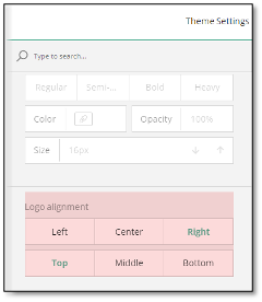
NOTE: Regardless of the position you set, the logo is always displayed on the right in the Designer tab.
Survey Title and Description
If your survey includes a title and description, you can customize their fonts and appearance using a dedicated set of properties. Since the settings for the description and title fonts are identical and located next to each other, this guide will focus on configuring the survey title font settings.
To change the font of your survey title, follow these steps:
-
Under Header, locate the Survey title font section.
-
Select a Font family from the drop-down menu.
-
Select the Font weight: Regular, Semi-bold, Bold, or Heavy.
-
Set the Font size in pixels.
-
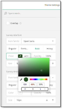
To access advanced survey title settings, toggle the View property to Advanced.
-
Locate the Survey title font property.
-
Use the Color property to select a color or enter an RGB, HEX, or HSL color code.
-
Adjust the Opacity of the survey title font in percent using the property located next to Color.
-
Locate the Text width property to set the width of the survey header area that contains the survey title and description.
-
Scroll down the settings in the Header category and locate the Survey title alignment property.
-
Align the survey title both vertically and horizontally using the available options to achieve the desired layout.
Customize the Header Area
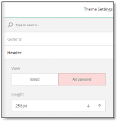
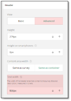
To customize header area properties, follow these steps:
-
Toggle the View property to Advanced to reveal additional header settings.
-
Set the header height for desktop devices using the Height property and for mobile devices using the Height on smartphones property.
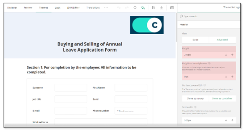
NOTE: You can preview how your survey looks on different devices > in the Preview tab by switching between available devices and > screen orientations.
-
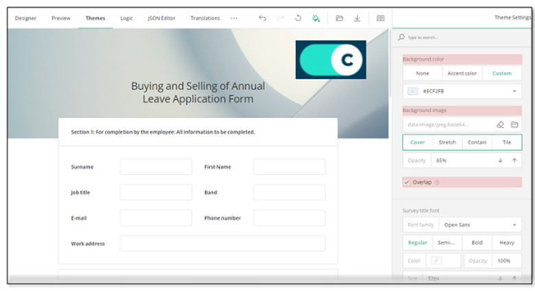
Locate the background settings within the Header category.
-
To change the color of the survey header, choose from the following Background color property options:
- None - Removes the individual header color, making it the same as the form background.
- Accent - Applies the accent color from the selected survey theme.
- Custom - Allows you to set a custom background color using the color picker (in RGB, HSL, or HEX format).
Alternatively, you can style the header background by uploading an image:
- Find the Background image properties.
- Paste a link to an image in the input field or click the Folder icon next to the property to upload a file.
- To set the image display style, choose from the following display options:
- Cover - Image fills the entire header area while maintaining its aspect ratio.
- Fill - Image is stretched to fill the header box without maintaining its aspect ratio.
- Contain - Image is resized to fit within the header box while maintaining its aspect ratio.
- Tile - Image is repeated to fill the entire header area, maintaining its aspect ratio.
- Set the transparency of the background image using the Opacity property.
- If you want the survey content to overlap with the header, check the Overlap checkbox in the header settings.
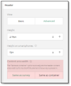
Adjust the Header Content Area
Follow the steps below to modify the width of the survey header area that contains content (survey title, description, and logo):
- Toggle the View property to Advanced to access additional header settings.
- Locate the Content area width property and set the area width:
- Keep the default option Same as container if you want the header content area to automatically adjust its width to match the space where your survey is displayed.
- Select Same as survey if you prefer the header content to match the width of the survey itself (its content).
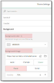
Background Options
The background color of your survey helps set the overall tone and appearance, making your form more visually appealing. To set the survey background color, follow the steps below:
- Under the Background category, locate the Background color property.
- Specify the background color in one of the following ways:
- Select a color from a drop-down menu or using a color picker.
- Enter an RGB, HEX, or HSL color code.
Alternatively, you can style the survey background by uploading an image:
- Under Background, find the Background image section.
- Paste a link to an image in the input field or click the Folder icon to upload an image.
- To set the image display style, choose from the following display options:
- Auto - Image maintains its original size and aspect ratio. Tiling applies if the image is smaller than the survey container.
- Contain - Image is resized to fit the container while maintaining its aspect ratio. Tiling applies if the image is smaller than the survey container
- Cover - Image fills the entire container while maintaining its aspect ratio.
-
You can also lock the image in place by setting the Image position toggle to Fixed, so the background remains stationary as you scroll the survey. To make the background move along with the content, switch to Scroll.
-
Adjust the image's transparency using the Opacity property.
Customize the Survey Look
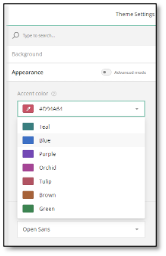
Accent Color
The accent color is used to highlight key survey elements, such as the survey title, selected choice options, and focused input fields.
Each predefined theme comes with a unique accent color, but you can easily change it by following these steps:
-
Under the Appearance category, locate the Accent color property.
-
Select a new accent color from the drop-down menu or use the Color Picker to set the color in RGB, HEX, or HSL. If you know the color code for the color you'd like to use, you can enter it directly into the Accent color input field.
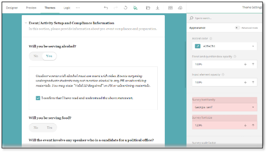
Survey Element Transparency
You can adjust the transparency of panels (sections that group questions) and question boxes (which frame individual questions) relative to the survey background. This setting can help create a cleaner look by blending these elements with the background. To set the transparency, do the following:
- Locate the Panel and question box opacity property.
- Adjust the opacity between 0% and 100% by using the spinner to achieve the desired transparency level.
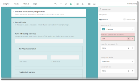
Similarly, you can customize the transparency of input elements (text boxes, Boolean toggles, the background of checkboxes and radio buttons) using the Input element opacity setting.
Survey Font
To change the font used in your survey, follow these steps:
- Locate the Survey font family setting under Appearance.
- Expand the drop-down menu and select a font from the available options.
NOTE: A specified Survey font family also applies to the survey title. If the title should have a different font, change the Survey title font property in the header settings.
To adjust the font size, use the Survey font size property. You can enter the desired size in percentage or use the spinner for easy adjustments.
Survey Scale Factor
The Survey scale factor setting allows you to increase or decrease the size of survey elements. Adjust the scale factor using the spinner to achieve the desired dimensions.
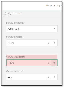
Corner Radius
The Corner radius property controls the roundness of all rectangular elements (panels, question boxes, input fields).
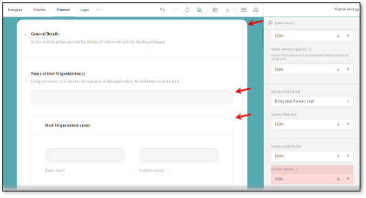
To set corner radii for specific elements, enable the Advanced mode toggle in the Appearance category and use individual corner radius settings.
Setting Survey Properties
Survey Property
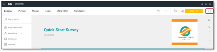
The Survey Property allows you to customize the overall look and feel of the survey. Make sure you have your cursor selected within the survey title then navigate to the top right of your screen and select the 'Survey Setting' icon.
This will reveal the panel that provides access to the survey properties:
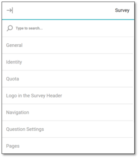
- General
- Identity
- Quota
- Logo In Survey Header
- Navigation
- Question Settings
- Pages
- Conditions
- Data
- Validation
- 'Thank You' Page
- Quiz Mode
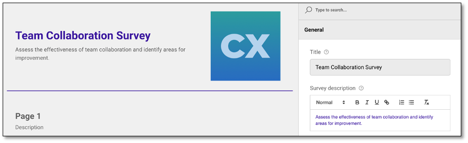
To edit each of these sections, select the tab you wish to edit, and a drop down will appear. In the General tab, you will be able to add and edit the overall survey settings like the title and description of the survey. You can make this visible to the respondent by checking the box below the survey description. This section also provides a Text Editor where you can format the text of the Survey Description using a variety of styling options such as text styles, bold, italic, underline, and more. These tools help improve the appearance of your content, highlight key information, and make it easier for respondents to read and understand.
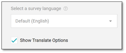
Additionally, you can choose the language in which the survey will be displayed. If you want to make the survey translatable, select "Show Translate Options" to choose the type of translation needed for the survey. To add a translation, switch to a new language and translate the original text here or in the 'Translation' module.
NOTE: Clicking the "Show Translate Options" checkbox in the General Properties pane allows respondents to choose from the available survey languages, letting them select their preferred language to complete the survey.
Click to navigate to the Translation Module
The survey can be utilized by respondents in two-ways:
- Read-only: which only allows the respondents to see the questions but not interact.
- Editable: which allows your respondents to interact and respond with the survey questions.
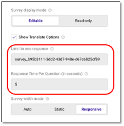
Limit to one response
To avoid duplicate submissions, the "Limit to one response" feature can be activated. A default random User ID (UID) will be either generated or pre-filled to support this setting. Once the survey is submitted, the system automatically assigns a unique cookie to the respondent's browser. This cookie marks the survey as completed and prevents any additional submissions from the same browser. The cookie is valid for one month and will be deactivated afterward, allowing the respondent to participate in the survey again if needed. This feature will also be deactivated if the respondent clears their browser cookies.
This approach ensures that each respondent can participate only once within the cookie's active period, preserving data accuracy without adding any hassle for the user.
Response Time Per Question
This setting allows you to define a minimum time threshold (in seconds) for each survey question to help detect potential speeding behavior when a respondent moves through questions too quickly. Any response submitted faster than the set threshold may be flagged for review.
- Default Value: The default is set to 5 seconds.
- Allowed Input: You may enter whole numbers only. Negative numbers and decimals are not allowed.
- Zero Value Behavior: Setting the value to 0 disables speeding checks for all questions, no responses will be flagged based on time.
To update the survey width mode, adjust the survey mode from auto, which is a combination of the two question types:
- Static: This is a fixed width.
- Responsive: The survey will occupy the full width of the screen.
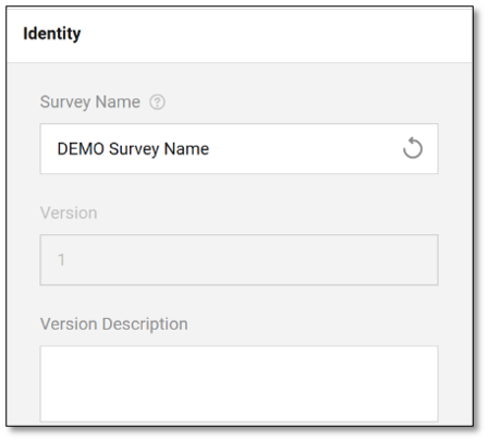
Following the General dropdown tab, there will be an Identity dropdown tab within the Survey Settings. This contains the survey name, version number and description. The version description helps identify the specific version of the survey if multiple versions exist.
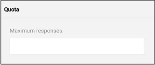
The Quota dropdown tab comes next, and it allows you to set a maximum number of completed surveys. Once this number has been reached, the survey will no longer accept additional submissions.
The fourth dropdown tab is the Logo in the Header. This feature allows users to upload their own logo, enhancing branding and personalization. It provides guidance on the prescribed width and height for the logo to ensure optimal display. Additionally, it includes options for the layout and positioning of the logo within the survey, ensuring it integrates seamlessly into the survey's design. To place an image in the header for a logo, utilize the 'Logo in the Survey Header' dropdown. Here you can select the file icon to upload an image for your logo. You can delete the image but selecting the eraser tool.
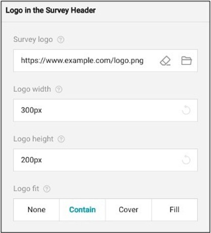
To modify the image size, use the logo width and height tool to adjust the fit. You may also apply the logo fit which applies your image in these ways:
- None: Image remains the original size
- Contain: Image is resized to fit while maintaining aspect ratio.
- Cover: Image fills the entire box while maintaining aspect ratio.
- Fill: image is stretched to fill box without maintaining aspect ratio.
Next comes the Navigation dropdown tab. The feature allows for you to customize the navigation for the respondent within the survey. In this section you can choose how the questions are displayed by adjusting the survey layout.
- Original Structure: Allows for the respondents to see the survey as it is currently presented.
- Show all questions on one page: This would allow all questions to be visible on one page when taking the survey.
- Show single question per page: This would show one question at a time when taking the survey.
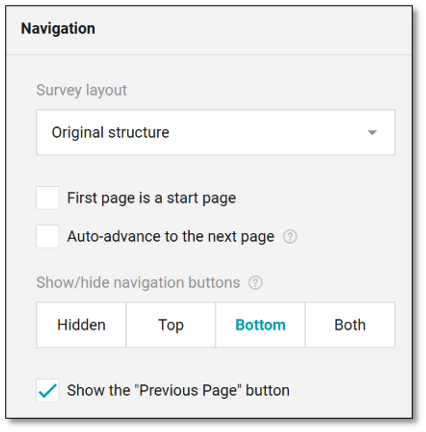
In this feature, you may also create navigation buttons for the respondents to move throughout the survey. By selecting where you would like the navigation buttons to be displayed you are indicating that you want navigation to be available for the respondents throughout the survey. By choosing 'Hidden' the ability to navigate throughout the survey will not be available to the respondents.
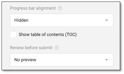
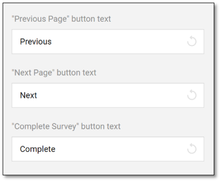
You can also have a visible Table of Contents to show the respondents where they are at within the survey. By checking this box it provides them with the ability to navigate where they are at within the survey. Here you may also allow respondents to see a preview of the finished survey before submitting. You may adjust the navigation buttons by selecting the 'Previous, Next, Complete' text and typing what you would like the buttons to say.
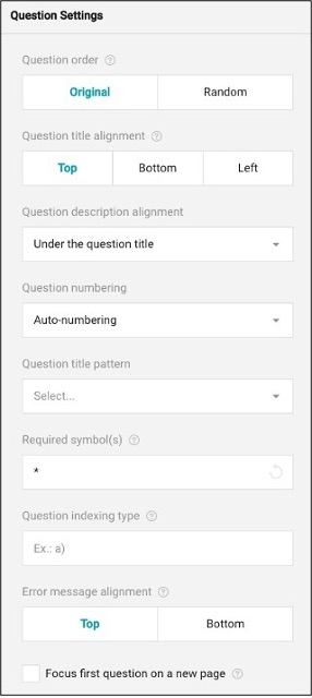
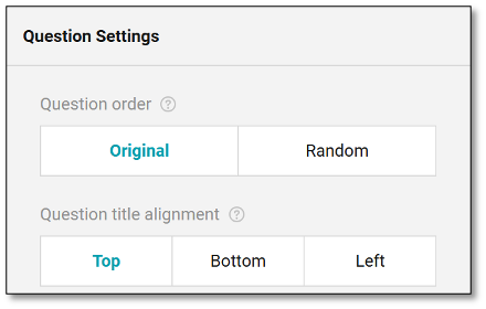
The Question Settings section manages the overall organization of your questions. You can find further question details in the Question Property panel.
To maintain the order of questions as they were created, select the 'Original' button under the question order. For random question order, choose 'Random'.
The questions can appear for the respondents at the top, bottom, or left aligned. You may change your question title alignment by selecting these buttons.
The question description can be displayed either below the title or at the bottom of the question pane. If you select:
- Under the title: The description will always appear directly beneath it.
- Under the input field: The description will position the description following the answer choices.
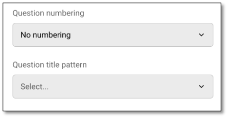
Question Numbering is set to "No numbering" by default to prevent confusion when users add, rearrange, or drag and drop new questions.
To adjust the style in which your bullets are displayed, refer to the 'Question title pattern.'
To indicate that there is a required step, use the 'Required symbol(s)' option to indicate to your respondents that this item is required. By typing a symbol in this blank, respondents will not be able to advance in the survey unless completing the step.
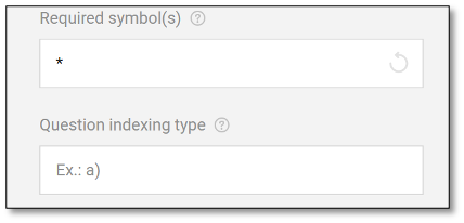
To use another type of numbering system, utilize the 'Question indexing type' to adjust your numbers to letters or patterns.
If an error message has to appear, use the error message alignment to indicate where the error message should appear for the respondents.
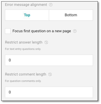
Finally, to restrict the length of answers or comments use the boxes provided to set the maximum length allowed.
The Restrict Answer Length limits the number of characters allowed in the main text entry field of a question. This helps control the length of responses, such as keeping them short or within a set format. The Restrict Comment Length limits the character count for optional comments related to a question. A value of "0" means no restriction is applied.
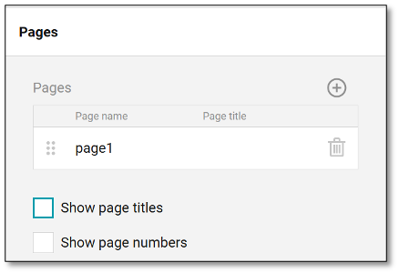
The Pages tab allows for the editing and customization of page names and titles. It also provides the option to show or hide page titles and page numbers, giving users flexibility in how the survey is presented to respondents. This feature helps in organizing the survey content clearly and enhancing the respondent's navigation experience.
To add additional pages, navigate to the top right of the panel and select the '+' icon. This will add additional pages. To delete a page, select the trash can icon aligned with the page you wish to erase. To edit a page name or title select the page number you wish to edit and then type the text you want to display.
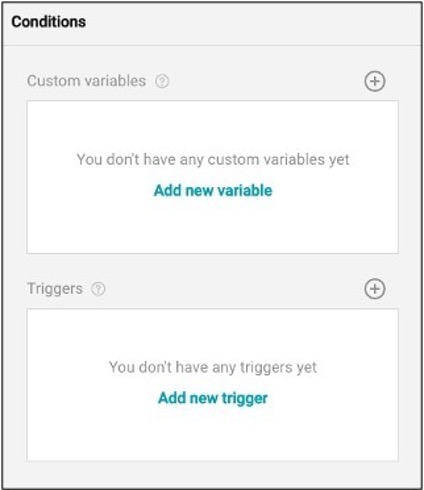
The survey Conditions tab allows the surveyor to create variables and triggers based on the respondents' input. The variables serve as intermediate or auxiliary elements used in form calculations, taking the respondent's input as a source value. Each custom variable has a unique name and an expression it's based on.
These variables are used in setting the logic to determine which questions a respondent should receive based upon their responses to previous questions. The trigger, on the other hand, is an event or condition driven by an expression; once the expression is evaluated as true, the trigger initiates a defined action. Such actions can optionally affect a specific target question.
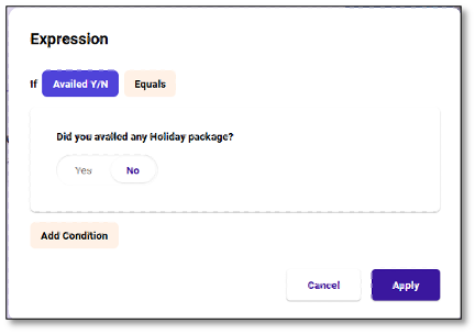
Example of a Trigger use:
Let's say you want to survey travelers.. If you ask the respondents if they avail of the holiday package, and they answered 'no' to this question, they would then be prompted to end the survey. This allows the surveyor to not continuously ask questions that may not be needed. If the answer is 'yes', it will proceed to the next question.
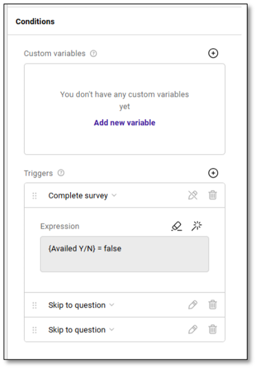
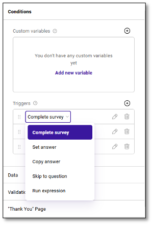
The Trigger Feature allows you to apply logic directly from the survey settings panel, serving as a shortcut to the Logic module. Within the Conditions section, you can set actions like Complete Survey, Set Answer, Copy Answer, Skip to Question, or Run Expression without navigating away. This streamlines the setup of survey behavior based on respondent input.
When selecting Run Expression, a compact expression builder appears, letting you define simple conditions (e.g., "If Availed Y/N = No") and apply actions instantly. You can also create custom variables for more advanced scenarios. This feature is ideal for making quick logic adjustments while designing the survey.
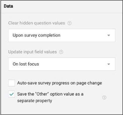
The Data tab is an advanced setting designed for linking and syncing values in the database for storage. It allows the survey tool to manage and clear hidden question values, update input field values, and automatically save survey progress. This functionality is particularly useful in surveys with conditional logic or questions that show/hide based on user input.
For example, in a product feedback survey:
- Hidden question values are cleared upon survey completion to avoid storing irrelevant data.
- Input fields update on lost focus, ensuring real-time data sync.
- "Other" option values are saved as separate properties, allowing clearer analysis of open-text responses.
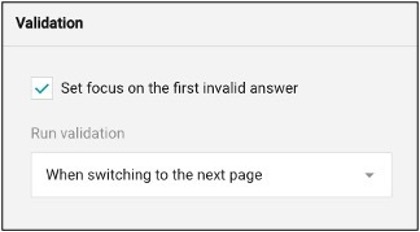
The Validation tab creates rules (expressions) that will trigger an "error message" if respondents do not fill out all required form fields or the format of values is incorrect before submission. It validates user responses immediately after an answer is entered or when respondents move to the next page or end the survey.
The Thank You Page tab enhances the post-submission experience for respondents. After submitting the survey, respondents can either be redirected to an external link or shown a customized thank you page with a personalized message. This helps create a positive end to the survey journey.
For advanced users, the Dynamic External Link and Dynamic "Thank You" Page Markup options allow you to tailor the post-submission behavior based on the respondent's input or survey logic. These features rely on expressions to dynamically generate content or URLs. However, if you're not familiar with HTML or expression writing, it's recommended to use the basic "Thank You" page editor, where you can enter a simple message without code.
Additionally, this tab can show a notification if a respondent has already completed the survey, ensuring clear communication and preventing duplicate submissions. To provide a thank-you message, simply enable the "Show the Thank You Page" checkbox and add your content in the provided text area.
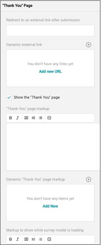
NOTE: To redirect respondents to an external website, make sure to enter the full URL, using a format like https://www.concentrix.com.
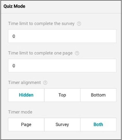
The Quiz Mode feature is designed to improve the survey experience by introducing a time limit for completing the entire survey or each individual page. This feature includes the ability to set and display a countdown timer that can be strategically placed within the survey layout to keep respondents aware of the remaining time. This helps maintain focus and encourages timely completion of the survey. When you select the box to use a timer you then have the option to customize that feature.
Page Property
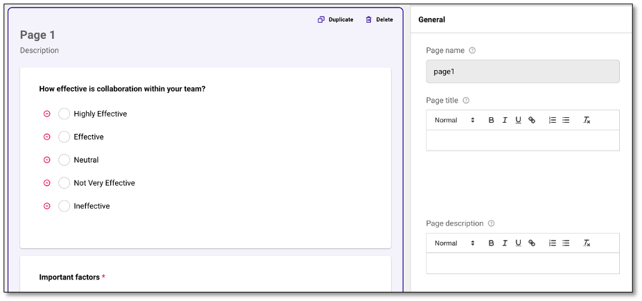
The Page Property feature allows you to customize various details of a survey page.
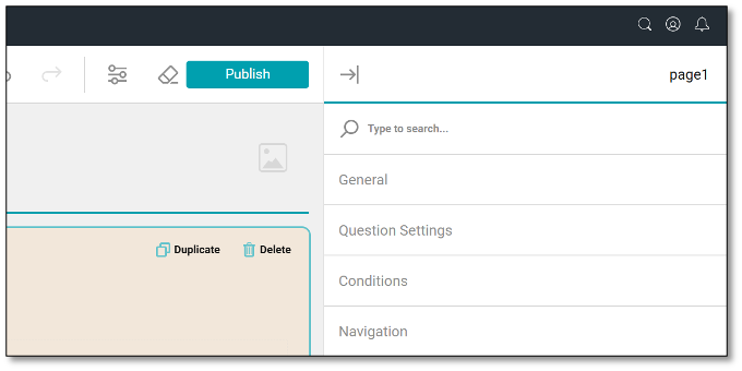
To the Page Property panel, navigate to the page you wish to customize and place your cursor within the page and select. The page will be highlighted once selected. Once the page is selected make sure your property panel is open. To open the property panel, navigate to the top right of your screen and select the icon with the arrow points to the line. Once in the page property panel, you will be able to customize the following:
- General
- Question Settings
- Conditions
- Navigation
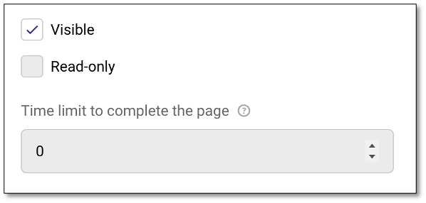
In the General tab, you can create a page name, title, and description, which can either be visible to respondents or hidden using the read-only options. Additionally, you can set a time limit for completing the page within this tab. You may also create a time limit of how long the respondents can remain on each page.
This section also provides a Text Editor where you can format the text of the Page Title and Description using a variety of styling options such as text styles, bold, italic, underline, and more. These tools help improve the appearance of your content, highlight key information, and make it easier for respondents to read and understand.
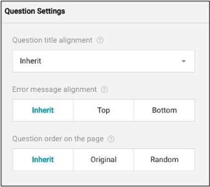
The Question Settings tab allows you to organize and align the questions on the page. The question title alignment can be set to left, top, bottom, inherit, or hidden, and applies to all questions on that page. You can also set the alignment for any error messages within this tab.
If you would like to create a specific order for your question on the page, you can also create that here.
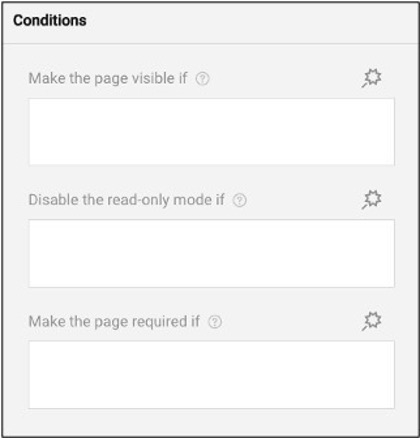
The Conditions tab feature controls the flow of the survey based on respondents' answers. This allows questions to be set as visible, read-only, required, reset value, or set value if the criteria or rules (expressions) are met. It also includes Skip Logic, which directs respondents to different questions or sections based on their input.
Additionally, survey logic can also be accessed and managed from the "Logic" tab at the top of the screen, providing a centralized view of all logic-related rules used throughout the survey.
Instead of displaying all questions or options at once, display logic enables the form content to adapt in real-time according to the user's input and show only relevant information. This makes the form more user-friendly and helps respondents complete it more efficiently.
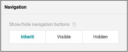
The Navigation tab allows you to control the visibility of navigation buttons (such as "Next" or "Previous") on each survey page. You have three options:
- Inherit: Follows the survey-level setting, which by default is set to "Visible."
- Visible: Forces the navigation buttons to appear on the current page, allowing respondents to move forward or backward.
- Hidden: Hides the navigation buttons on the current page, which can be useful for custom-designed flows or when you want to control progression through other means (e.g., triggers or logic).
Question Property
Depending on the question type you have selected, the options in the Question Property may vary. To access the Question Property, navigate and select the question you wish to customize, then expand the property panel at the top right of your screen.
In the Question Property Panel, you can customize the following options:
- General
- Choice Options
- Quota Settings
- Choices from a web service
- Layout
- Conditions
- Data
- Validation
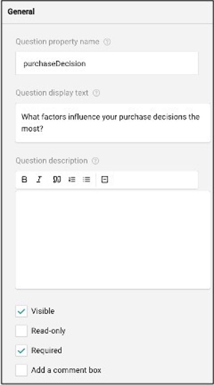
In the General tab**,** you can edit the property name. The property name is only visible to the survey creator, not the respondents. Below the property name, you can edit the question display text. The question display text is where your question will be entered.
As a survey creator, you can create a question description if the respondents need additional information. Within this subsection, you can make this visible to your respondents, which allows them to be able to see the additional information. If the surveyor selects the 'Read-only' option, the respondents are not able to interact with the survey question.
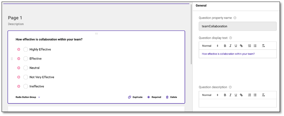
This section also provides a Text Editor where you can format the text of the Question Display Text and Description using a variety of styling options such as text styles, bold, italic, underline, and more. These tools help improve the appearance of your content, highlight key information, and make it easier for respondents to read and understand.
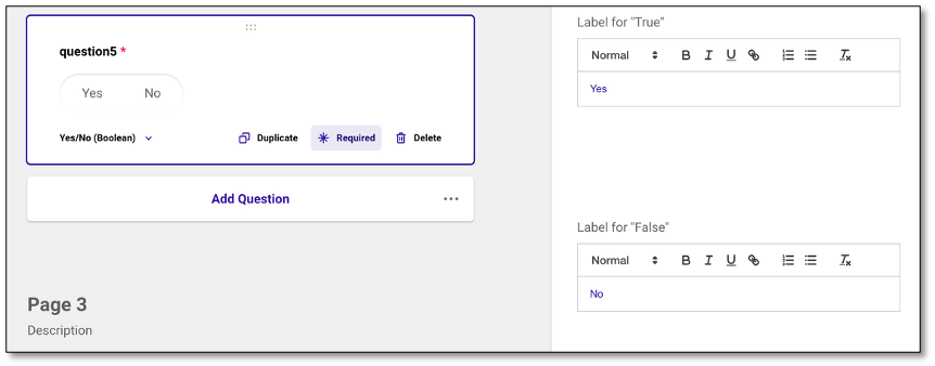
For specific question types such as Boolean, File Upload, Panel, and Signature, a separate section is available where you can use the Text Editor to customize labels and placeholder text. This helps you refine formatting, improve the overall appearance, and make the content clearer and easier for respondents to understand.
Boolean Type of Question
Panel Type of Question
You can mark the question as required or mandatory. Respondents won't be able to proceed to the next section unless they've answered it.
Lastly, you may create a comment box if the question requires a free-text response, you can enable a comment box for open-ended answers.
In the Choice Options tab, you can fully customize the answers provided to respondents. By selecting the answers listed, you can easily reorder them into your preferred arrangement by dragging them. If you need to modify any of the answers, simply click the pencil icon next to the answer you'd like to edit. In the Choices section, selecting the pencil next to a choice also allows you to control how a choice behaves based on specific rules.
You can set conditions to make a choice visible or selectable based on a response from a previous question. This helps customize the survey flow based on respondents' previous answers, where the content adapts to the respondent's answers, enabling you to create dynamic surveys where only relevant choices are shown depending on the input provided.
To add additional answers, click the '+' icon located at the top right of the screen. For a more automated approach, you can use the AI-generated answers feature by selecting the wand icon in the choice detail panel. This will prompt the AI to create answers corresponding to your question. You can generate new responses by selecting the tool again if necessary. If you need to remove all answer choices at once, click the eraser icon at the top right. Additionally, you can choose how your answers are displayed---options include ascending, descending, random, or no order. If you want to reuse answers from another question, use the "Copy from another question" dropdown to populate those responses.
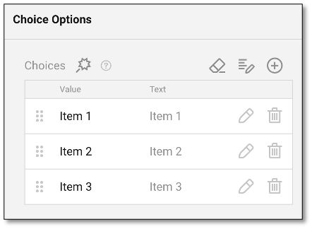
When creating a question type that uses multiple choices, such as radio button group or checkboxes, the system initially generates default options with both Value and Text fields automatically synced. Typically labeled as Item 1, Item 2, and so on. As you begin customizing these choices, it's important to understand how Value and Text behave. If you update the Value, the Text will update accordingly. However, if you change the Text directly, the Value remains unchanged unless you edit it manually.
The Value serves as the identifier stored in the database and is used for aggregating and analyzing results. The Text, on the other hand, is what respondents see on the survey. Because of this distinction, changing only the Text (while keeping the Value the same) will ensure that data from newer survey versions is aggregated correctly with past versions.
NOTE: For most users, it's recommended to simply update the Text while keeping the Value unchanged. This ensures consistent data aggregation across survey versions while allowing flexibility in how choices are presented to respondents.
Copying list of Choices
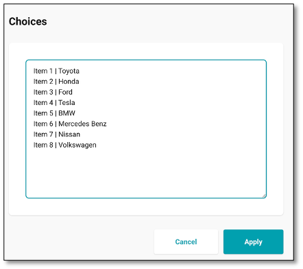
You also have the option to copy a list of choices from an external file to avoid entering each Value manually. Simply click the 'Edit' icon next to the plus sign. Make sure to separate the Value and Text using a pipe (|) delimiter to follow the required format.
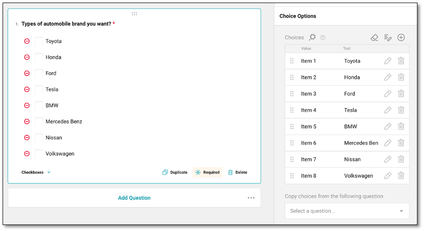
NOTE: The magnifying glass icon next to the word 'Choices' is an AI-powered tool that suggests list of choices based on the context of your survey.
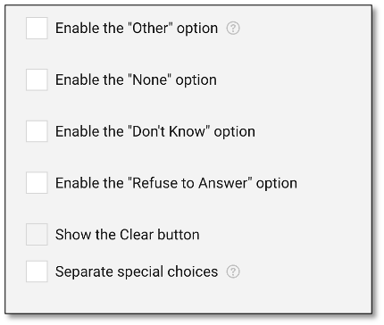
In this section, there are templatized answers as well that you can enable such as "None, Refuse to Answer, Other and Don't Know." providing more flexibility and inclusivity for respondents. These choices are automatically anchored at the bottom of the choice list. It will remain in place and will not be randomized, even if randomization is enabled for the choice list.
Transferring Choices
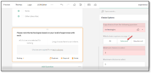
To transfer response list from one question to another, start by selecting the question you want to populate. In the Choice Options panel, use the Copy choices from the following question dropdown to select the source question, then choose "Selected" under Which response options to copy to include only the respondent's chosen answers.
You can also define minimum and maximum choices as needed. This is helpful for follow-up questions, such as ranking previously selected items. Note that when you copy choices this way, the new question is dynamically linked to the original, meaning the response list can only be updated in the source question. If you want to create a fully editable version, consider duplicating the question instead, this allows you to modify the response list independently without affecting the original.
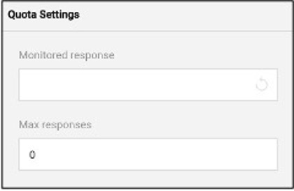
The Quota Settings tab allows you to monitor and limit how many times a specific answer can be selected from the Choice Options list. As a survey creator, you may put one of your answers from the Choice Options list in the monitored response. Once a Choice Option selection is marked as monitored, you can set a maximum number of responses for that option.
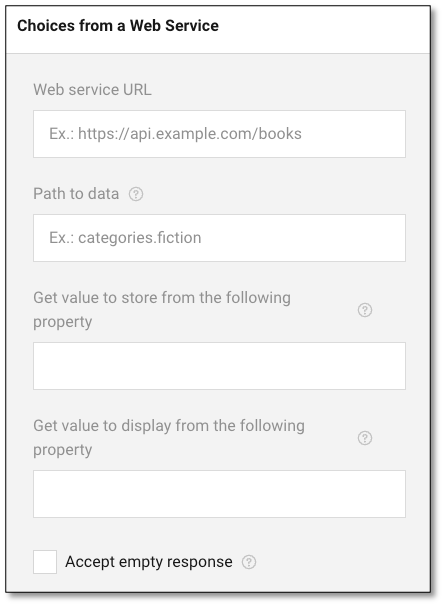
The Choices from a Web Service feature allows survey creators to dynamically populate answer choices from an external data source. To use this feature, start by entering the Web Service URL, which is the endpoint where the data is hosted (e.g., https://api.example.com/books). Next, specify the Path to Data to define the exact location in the response where the list of choices can be found (e.g., categories. fiction). Then, in the Get value to store field, enter the property name from the data that should be saved in the survey response.
In the Get value to display field, enter the property name that will appear as the label or visible choice to the respondent. Optionally, you can check the Accept empty response box if you want to allow users to skip the question or submit an empty selection. This feature is ideal for surveys that require up-to-date or dynamic lists pulled directly from external systems.
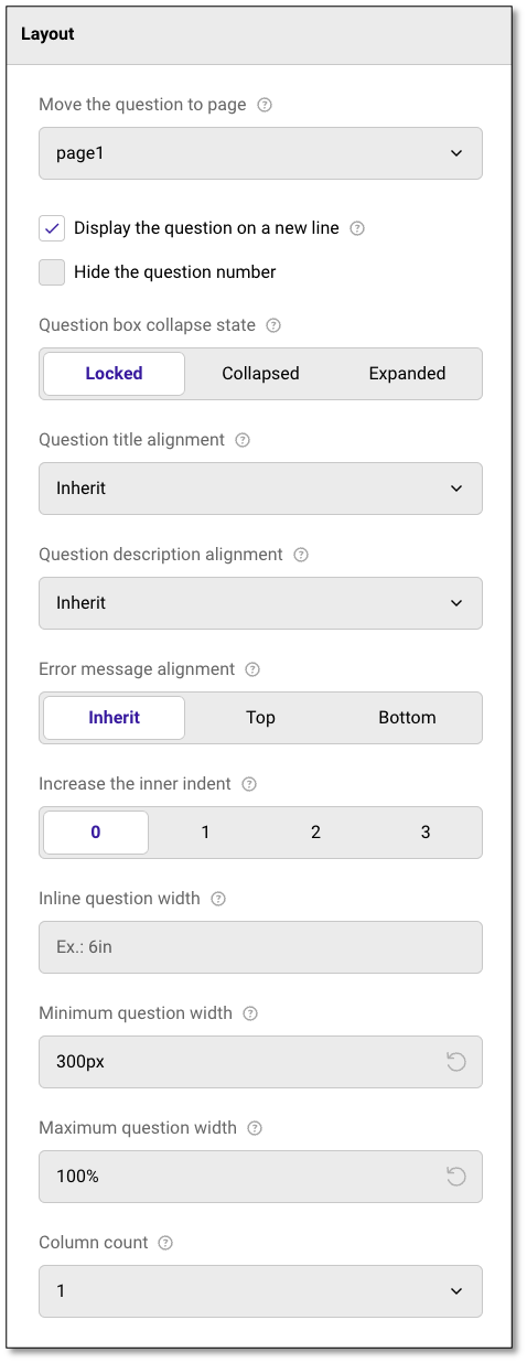
In the Layout tab, you can customize the way each question appears. This section allows you to adjust how each question is displayed, aligned, and indented relative to the rest of the survey.
You can use the dropdown menu to move questions between different pages within your survey, facilitating easy reorganization. By default, questions are displayed on separate lines.
However, if you prefer to have your questions aligned on the same line, you can deselect the option to "display the question on a new line." Additionally, you can use the checkboxes to hide question numbers, further tailoring the layout to fit your survey's design and readability needs.
In this section, you can choose how you wish to display the question box. You have three options:
- Locked: The questions box is displayed in full and cannot be collapsed
- Collapsed: The question box initially displays only the title and description, but can be expanded by respondents
- Expanded: The question box is displayed in full and cannot collapse.
To edit the alignment of the question title and description, use the inherit dropdown menu. You can choose from several options: inherit, top, bottom, left, or hidden
Here, you can also assign where you would like an error message to be displayed. To adjust the inner indent of the question box, use the number settings (0-3) to add space or margin between the question content and the left border of the question box. This helps in fine-tuning the layout for better visual clarity and alignment.
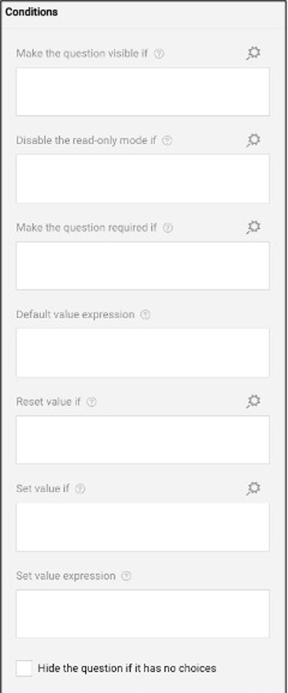
The Conditions panel allows you to control how a question behaves based on specific rules or expressions. You can set conditions to make a question visible, required, or read-only, assign a default value, reset or set a value dynamically, and hide the question if it has no available choices. This helps customize the survey flow based on respondents' previous answers.
This feature enables you to create dynamic surveys where the content adapts to the respondent's answers, ensuring that only relevant questions are shown based on the provided input.
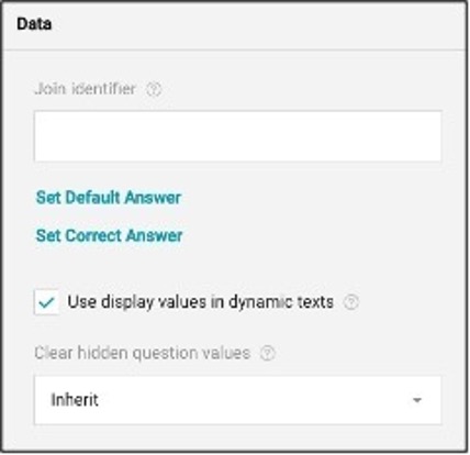
The Data tab lets the surveyor control how a question behaves and stores its data. You can create a Join Identifier, which is a custom key used to link several questions together and sync their values. These linked values are combined into a single array and stored in the results using the key as the property name. You can also set a default answer for the question, or choose a correct answer by clicking on Set Correct Answer.
This is helpful when testing knowledge or validating responses. Enabling display values in dynamic texts ensures that readable answer labels appear in follow-up messages. Additionally, you can decide when to clear hidden question values, and adjust the inline question width by setting minimum and maximum width to control how the question appears on the page.
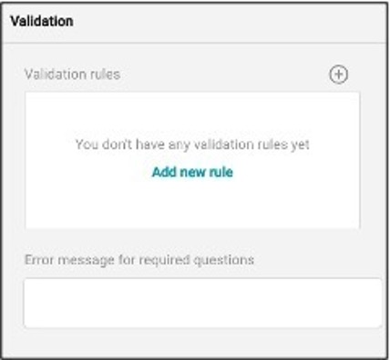
The Validation tab allows you to create custom rules and error messages to ensure accurate and complete responses. You can click "Add new rule" to define specific validation rules based on expressions. For example, requiring a numeric value or limiting character count. These rules help control the input format and ensure data consistency.
You can also set a custom error message for required questions, which appears when a respondent skips a question that must be answered. Additionally, by using Error Message Expressions, you can conditionally show error messages based on the respondent's input. This provides more flexibility in guiding users to correct their responses before submission, helping maintain the quality and accuracy of the data collected.
Previewing the Survey
To preview the survey before publishing, navigate to the top left of your screen and select the Preview Module. Once you are in the preview mode, you will be able to see the survey from the respondent's perspective.
To exit the survey mode and return to editing, navigate back to and select the Designer Module.
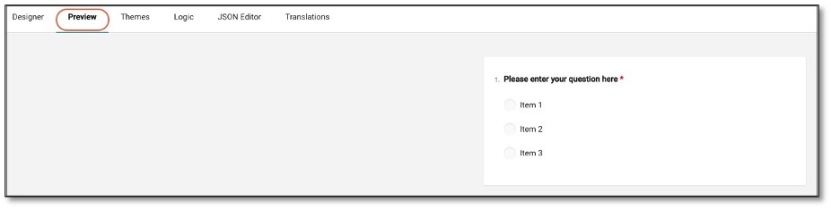
As you scroll to see the rest of the survey, the questions are presented to you as a respondent will see them, allowing you to test the functionality of the questionnaire.

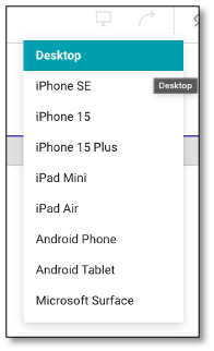
The Preview tab allows you to see how your survey will appear across various devices and screen orientations. You can toggle between desktop, tablet, and mobile views to ensure your survey displays correctly on all screen sizes.
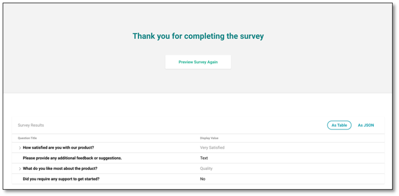
At the conclusion of a Preview, you will be presented with the "Thank You" page, and a table showing how you responded to the survey. Please note, the Thank You page external link redirects will not render during a Preview mode. You can see the survey results in the table or JSON format. Click the Preview Survey Again button above the results if you want to preview the survey again.
To further customize the survey while looking at the preview, you can also change the appearance under the Themes Module.
Saving and Publishing the Survey
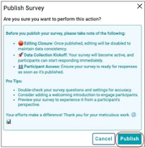
To publish your survey, navigate to the survey status at the top right of your screen. The current status should be color blue for publish or yellow for draft.

Click the survey status button and navigate to the bottom right of your screen. Select the publish survey icon. By selecting the publish survey icon, you will be prompted to a modal window to review the survey for accuracy and clarity. If you are ready to proceed, click the Publish button.
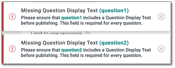
NOTE: In a Panel workflow, the Panel Title is optional and is not part of the question description validation. The Image question type is also excluded from this validation. Only questions without display text will trigger an error. The system will now display specific error messages identifying each question missing display text, offering clearer guidance for resolution.
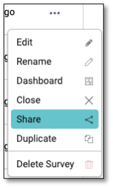
Once published you can share your survey by navigating to the menu icon and selecting the surveys dropdown.
Once you have selected the survey's dropdown you will be shown all your current surveys and their status. Navigate to the survey you wish to share and select the ellipsis icon (the three vertical dots).on the right. From the icon list select the 'Share'.
When you click the Share button, a modal window will appear. To share the survey link, click the duplicate page icon to copy the link and paste it wherever needed. You can also use the icon next to it to open the survey link directly in a new tab.
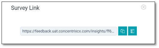
NOTE: Most users will prefer to send the survey using the Contacts & Distribution feature rather than manually copying the link. We'll cover that method in more detail later. The Share option is helpful if you need a quick, direct link for manual distribution.

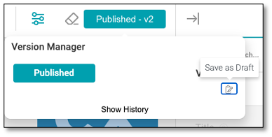
Survey Status
To determine the status of your survey, check the top right of the screen. The colors will indicate the following statuses:
-
Publish: By default, the status is set to Publish, but you can still edit the survey.
-
Draft: The survey is not yet finalized and can still be edited or updated.
-
Published: When a survey is marked as Published, it is active and can no longer be edited. However, you can switch it back to Draft mode if changes are needed.
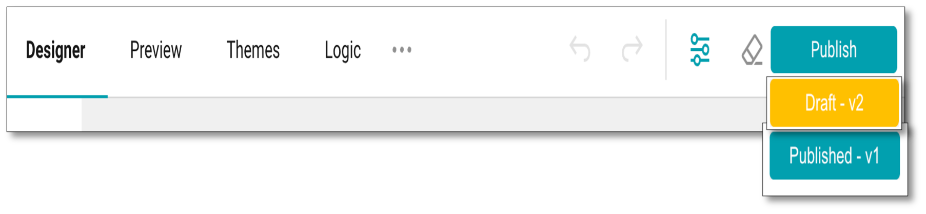
NOTE: To edit a published survey, you can switch it back to Draft mode by clicking the 'Save as Draft' icon found in the status button at the top right corner. Once in draft mode, the survey can be modified or updated as needed.
Creating and Managing Survey Contacts
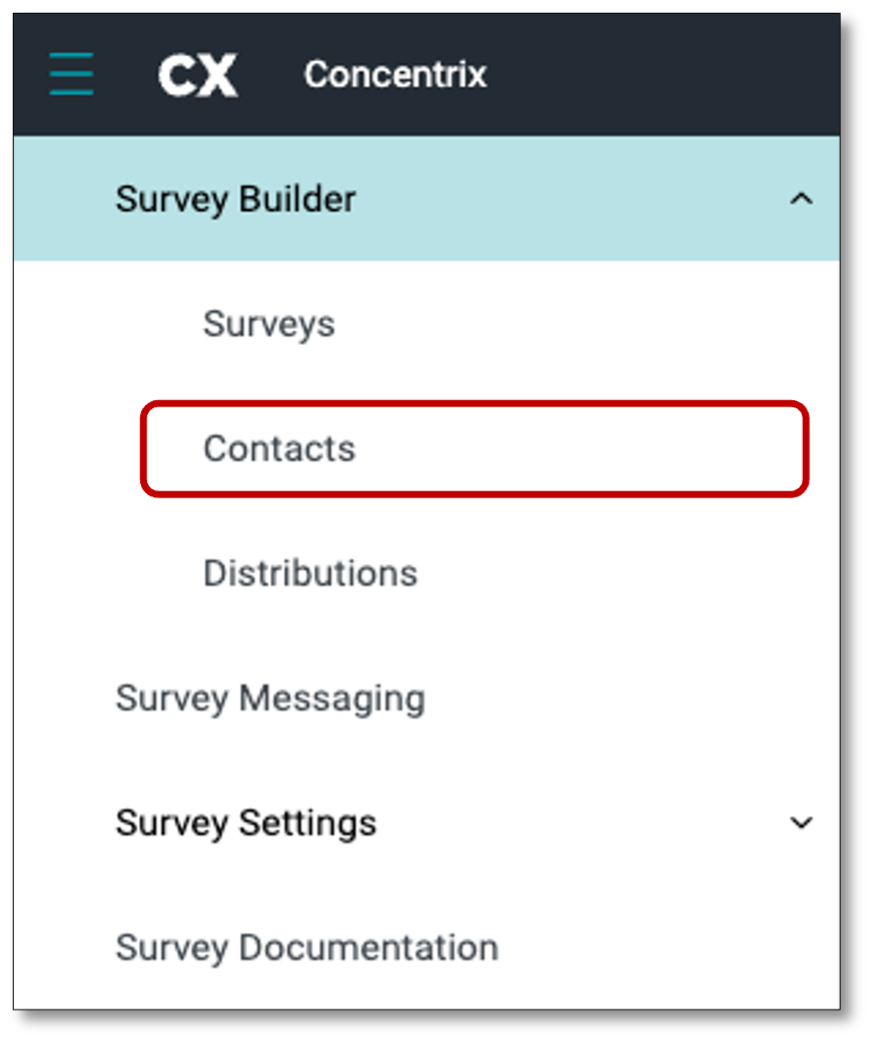
To manage the recipients of your surveys, navigate to the menu icon at the top left of your screen and select the ‘Contacts’ tab.
NOTE: Contacts refer to the list of respondents who may be invited to take the survey. This is also commonly referred to as a “Sample” or “Customer List.”
The Contacts tab serves as your database, displaying the complete list of your contacts. This is also where you can create a Contact Group thru file upload.
The Contact Group tab allows you to organize your contacts into reusable groups for easier management. By creating groups, you can quickly segment contacts, making it simpler to target specific audiences for campaigns or communications. From this tab, you can view, edit, delete and update your contact groups.
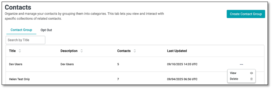
The Contact Group table displays a list of all created groups along with key details for easier management. Each column provides the following information:
- Search by Title: A search bar that allows you to quickly locate a contact group by entering its title.
- Title: The name of the contact group. This is the main identifier that helps you quickly locate and manage groups.
- Description: A short summary or notes about the group, such as its purpose or the type of contacts it contains.
- Contacts: The total number of contacts included in the group. This gives a quick overview of the group size.
- Last Updated: The date and time when the contact group was last modified. This helps track the most recent changes or updates.
- Ellipsis Menu: Provides additional actions for managing a contact group:
- View - Opens the selected contact group to see its details and members.
- Delete - Permanently removes the contact group from the system.
To prepare for file upload, we'll build a list of invitations in a CSV file. This is done in an Excel workbook and then saved specifically as a CSV. Follow this example below to create a short list of survey respondents in your Excel Workbook.
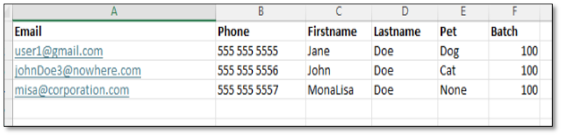
Your file must include at least an email address. You can also add other columns with details about each respondent. These details can help customize the survey experience and will be saved with the responses to facilitate data analysis.
Notes on the input file:
- Always include an email column containing a unique address -- no duplicates.
- Limit the facts to one value per cell (e.g., don't put "Dog, Cat" in the column.)
- Make sure that every cell has a value in it, even if sometimes it says "None".
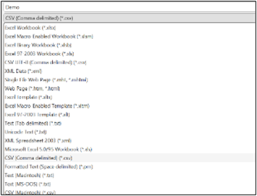
Save the file as type CSV, of up to 50 MB file size.
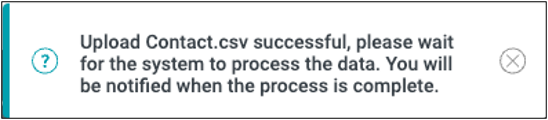
With your file now prepared, at the top left of the screen, select the menu icon, go back to your Contacts module, then click the 'Create Contact Group' button. Indicate your Contact Group Name and Description, then click the 'Drag & drop some files here or click to select files' canvas to upload the file.
NOTE: Contact Group Name is a required field and must be filled in before you can create a Contact Group. This will enable the 'Create' button.
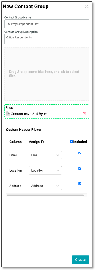
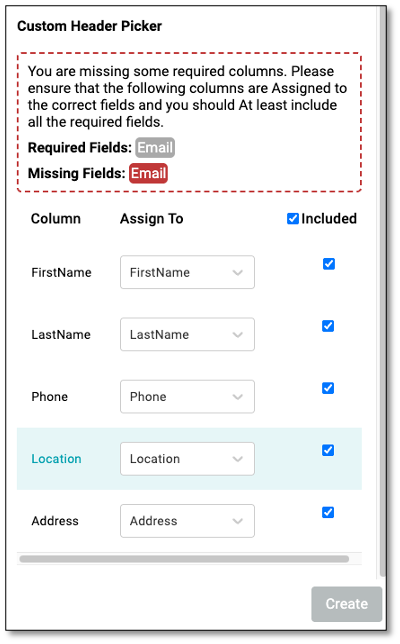
NOTE: A warning message will appear if the required email address is missing from the uploaded file.
The uploader will read the column headers and prepare to upload records. You may also choose whether to include columns in the upload. We'll include them all.
Select 'Create'.
Then you will see the Contact Group Name you created under the Contact Group tab. We now have a contact list to target with invitations. To invite contacts for participation in a survey, we will create a Distribution.
How to Add Emails to the Unsubscribe List using the Opt Out Feature
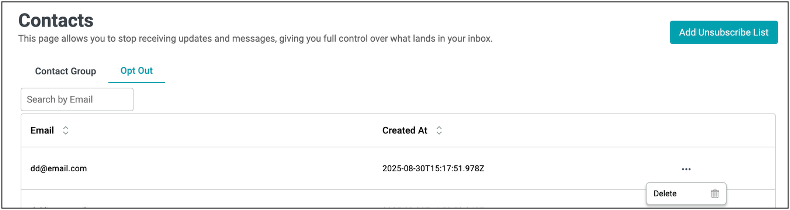
The Opt Out feature allows users to manage email preferences by unsubscribing specific contacts from receiving survey invitations, updates, or messages. Once an email is added to the Unsubscribe List, it will automatically appear under the Opt Out tab, ensuring the contact will no longer receive any communications.
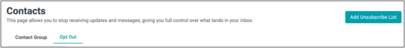
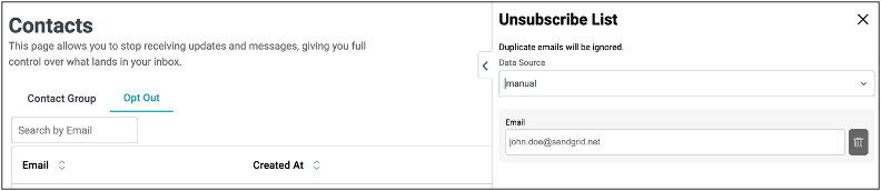
To add contacts to the unsubscribe list, begin by clicking the Add Unsubscribe List button located at the top right of the screen. A new panel titled Unsubscribe List will appear, allowing you to choose the data source.
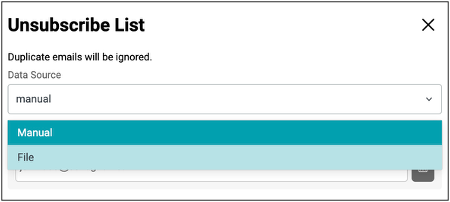
You can either select Manual to enter individual email addresses one at a time or choose File to upload a CSV file containing multiple email addresses. Once you have entered or uploaded the email addresses, the system will automatically ignore any duplicates to prevent redundancy. Finally, click Create button to complete the process and it will automatically add the email/s to the unsubscribe list table.
To resubscribe an email, simply remove it from the list by clicking the Delete icon found under the ellipsis menu.
NOTE: Survey Respondents who select the 'Unsubscribe' option from the link in the survey invitation will automatically be added to the Opt Out list.
Distributing a Survey
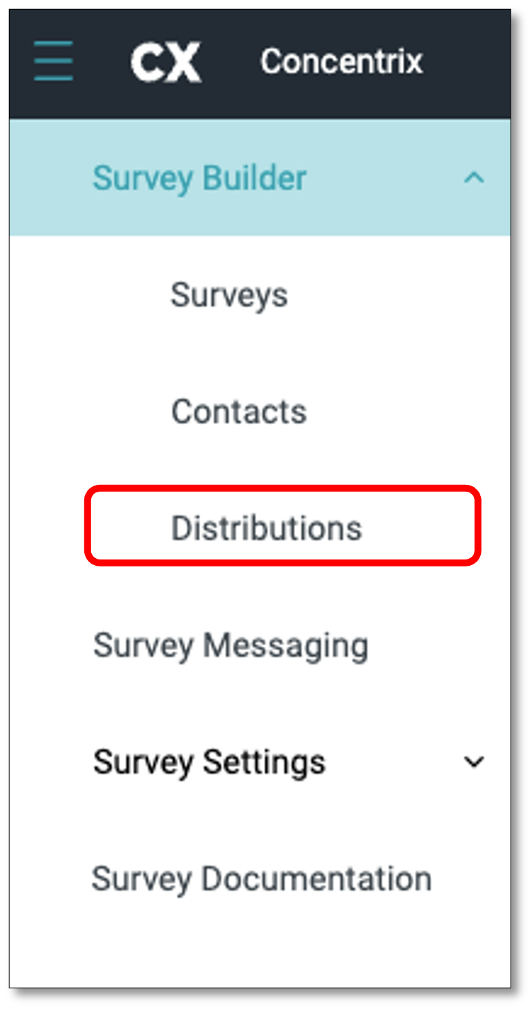
Once you've created your contact list and published your survey, you're ready to distribute it. To do so, go to the top-left menu toolbar and click on the Distributions tab to start sending out your survey.
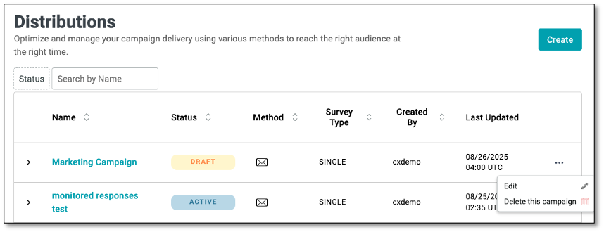
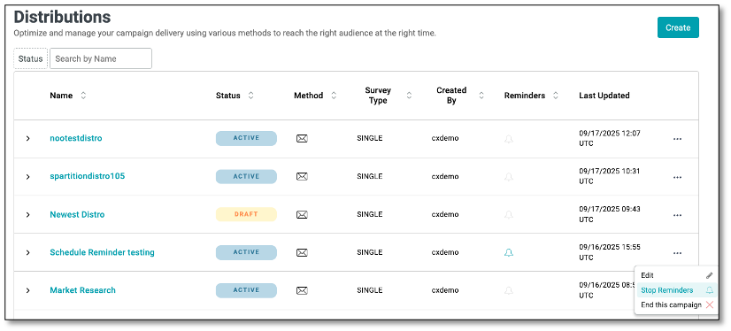
The Distribution Table displays a list of all created distribution along with key details for easier management.
Each column provides the following information:
- Status Filter: A dropdown option to filter campaigns by their current status (e.g., Draft, Active, Completed).
- Search by Name: A search field that lets you quickly locate a specific campaign by entering its distribution name instead of scrolling through the entire list.
Table Columns
- Name: The title of the distribution campaign. Clicking the campaign name may open detailed settings or reports for that campaign.
- Status: Indicates the current state of the campaign (e.g., Draft, Active).
- Method: Displays the method of distribution used (e.g., email). The icons represent the specific delivery channel.
- Survey Type: Shows the type of survey being distributed (e.g., Single, Multi, etc.).
- Created By: Displays the username of the person who created the distribution campaign.
- Reminders: Displays a bell icon indicating the reminder status of each campaign.
- Last Updated: Shows the date and time the campaign was last modified.
- Ellipsis Menu: Provides additional campaign management actions:
- Edit - Opens the selected campaign for modifications.
- Delete this Campaign - Permanently removes the campaign from the system. (Use with caution, as this action cannot be undone.)
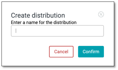
On the Distribution page, navigate to the top right of your screen and select the 'Create' button. Then enter a name for the distribution.

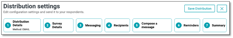
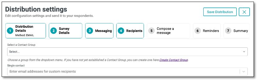
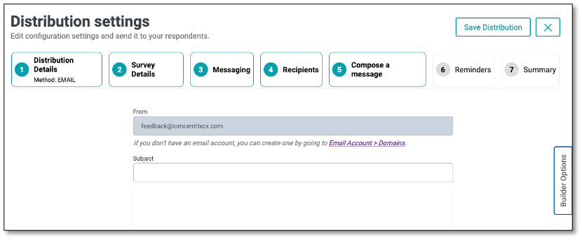
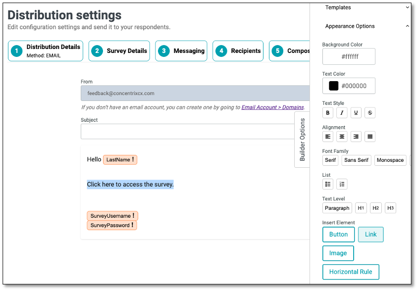
The Distribution Settings guide you through the step-by-step process of configuring and sending your survey to respondents. Each tab represents a stage in setting up your campaign:
- Distribution Details Define the basic setup of the distribution, including the delivery method (e.g., Email, Link). This is where you establish how the survey will be sent.
- Survey Details Select and confirm the survey that will be attached to the distribution. You can review key information such as the survey name and description to ensure the correct survey is being delivered.
- Messaging Allows you to configure the different communication pages and templates that respondents may encounter during a survey distribution. This ensures consistent branding, clear instructions, and better respondent experience.
- Recipients Choose or import the list of contacts who will receive the survey. You can select from existing contact groups or add recipients manually.
- Compose a Message Draft and customize the actual message body that will be sent to recipients. This can include personalized text, links, and formatting to make the invitation engaging.
- Reminders Set up automated follow-up emails for recipients who haven't completed the survey by scheduling when and how often reminders will be sent.
- Summary Review all configuration details (distribution method, survey, messaging, recipients, and message content) before sending. This tab acts as the final confirmation step.
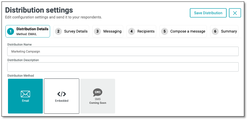
In the 'Distribution Details' tab, the distribution name you created initially will be displayed. You can add an optional description in the provided field to give more context. Then, select the method for sending the campaign, either by email or by embedding the survey for distribution (Coming Soon).
- Email: Delivering the survey through the respondent's email
- Embedded: Deliver in-app surveys or website intercepts by embedding them into your website or application
NOTE: There's another option to distribute the survey, thru Share URL: Sending the survey using the 'Share' button with the survey link. Refer to the Survey List page, look for the ellipsis icon (the three vertical dots).
After you have completed those tasks, select the 2nd tab at the top of your screen to move to the 'Survey Details' tab. Select the survey type you wish to distribute.
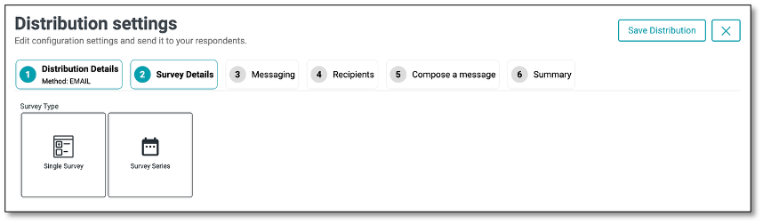
There are two types of surveys:
Single Survey is designed to provide feedback on a specific survey. It can be scheduled to appear multiple times within a designated period, offering respondents multiple chances to participate. If no start or end date is specified, you can configure the occurrences to determine how frequently the survey is displayed based on a selected time interval. When this type is selected, the Reminders tab will become available, allowing you to enable and configure reminders if needed.
Survey Series is a structured collection of multiple surveys that are sent out in a predefined order over a period of time. This allows for a more comprehensive assessment by collecting insights at different stages or from various perspectives.
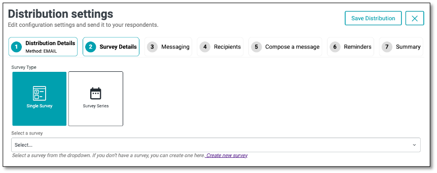
To distribute a Single Survey, navigate to the distribution settings and select 'Single Survey'. Once in the Survey Detail, select 'Single Survey' within the survey type options. By selecting the Single Survey, you will see a dropdown appear. Select the surveys you create to be used for distribution.
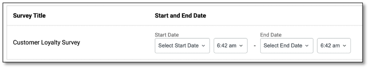
After selecting a survey, you can customize its start and end dates---along with the time---by clicking the Start and End Date option located on the far right of the survey panel. A calendar will appear, allowing you to choose your desired start date. Use the '<' and '>' buttons at the top of the calendar to navigate between months. Once the start date is selected, reopen the dropdown to set the end date and time using the same calendar interface.
If you would like your recipients to remain Anonymous, enable the anonymous tab, recipients will not receive personalized URLs, and their responses will not be tracked.
To have recipients have a username or password protected enable the username and/or password.
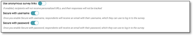
Username Once you enable Secure with username, respondents will receive an email with their username, which they can use to log in to the survey.
Password Once you enable Secure with password, respondents will receive an email with their password, which they can use to log in to the survey.
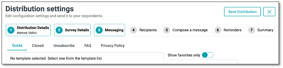
Next step is the 'Messaging' tab, it allows you to configure the different communication pages and templates that respondents may encounter during a survey distribution. This ensures consistent branding, clear instructions, and better respondent experience.
Available Messaging Sections:
- Authentication Set up custom messages for login or access authentication pages to ensure only authorized respondents can participate. This option is available only when 'Secure with Username' feature has been selected.
- Quota Configure the message shown when the survey quota has been reached, informing respondents that no further responses can be accepted.
- Closed Define the custom message displayed when the survey has ended or is no longer accepting responses.
- Unsubscribe Create a branded unsubscribe page template that allows respondents to opt out of future survey invitations.
- Resubscribe Allow respondents who previously opted out to rejoin and receive future survey invitations by accessing a branded resubscription page.
- FAQ Provide a Frequently Asked Questions page to help respondents find quick answers and reduce confusion.
- Privacy Policy Display a privacy statement outlining how respondent data will be collected, used, and protected.
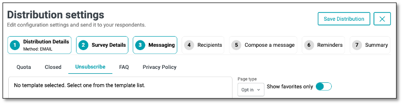
The Opt-In/Opt-Out functionality in the Unsubscribe tab allows you to control how recipients manage their participation in future survey communications.
- Opt-In: Allows respondents to confirm their interest in receiving future survey invitations. Use this when consent is required before including them in future outreach.
- Opt-Out: Gives respondents the option to unsubscribe from future survey communications. Ideal for letting users easily opt out via email links or unsubscribe pages.
NOTE: Use these settings to comply with data privacy policies and provide respondents with control over their communication preferences.
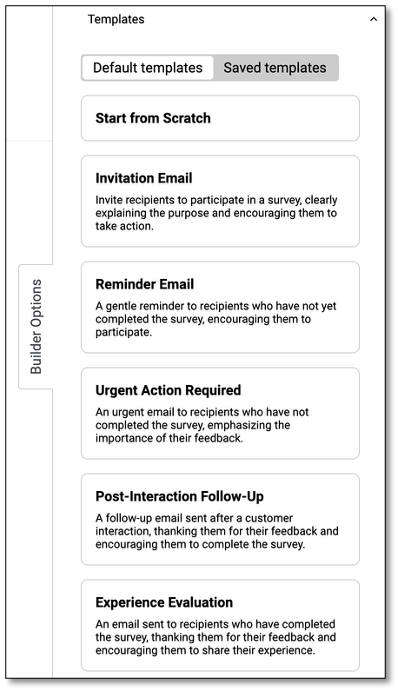
Template Selection
On the right side, you can select from a list of available templates (e.g., Untitled, Test template, Log in Page). Each template can be previewed, reused, or marked as a favorite for quick access. Toggle Show favorites only to filter the list to your most frequently used templates.
NOTE: Templates can be configured by users with the appropriate access level under the Survey Messaging section from the main menu
After you have input the messaging setting, select the fourth step within the distribution process of choosing the recipients. In the 'Recipients' tab, utilize the dropdown to select either an entire contact list from the lists you previously created or a single contact.
Next, you can create a message that your recipients will receive when getting the survey. This can explain the purpose of the survey or instructions on how to complete it. To 'Compose a Message' tab, select the fifth step within the distribution.
Before we dive into composing a message, let's first explore the Builder Option feature, which allows you to customize messaging for our survey respondents.
Builder Options Tab
Builder Options - Templates
The Builder Options - Templates panel allows you to choose from pre-designed email templates or start from scratch when creating survey-related emails. These templates help you quickly craft messages for inviting, reminding, or following up with respondents.
- Default Templates: A set of ready-made templates to use as-is or customize for your needs.
- Saved Templates: Access and reuse templates you've previously created and saved.
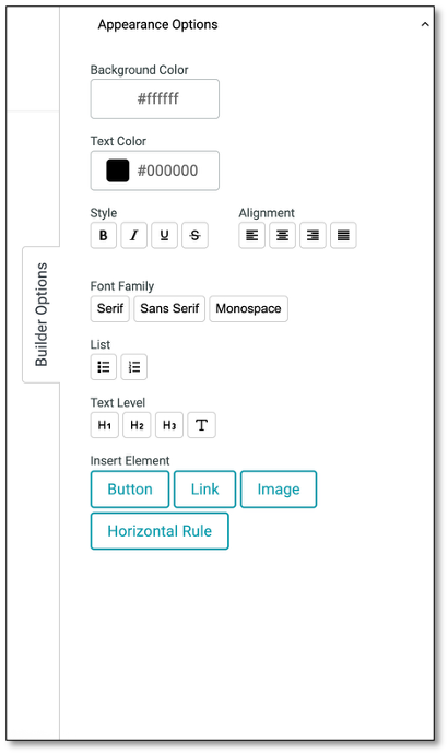
Builder Options - Appearance Options
The Builder Options - Appearance Options (found at the bottom of the Templates tab) is a panel to design and format your survey email. Apply styles like bold, italics, underline, and headings to make text stand out. Adjust font type, size, text color, and alignment for a polished look. You can also insert buttons, links, images, or dividers to enhance engagement. Customize background and text colors to match your branding and use lists for better content structure.
| Name | Functions |
|---|---|
| Appearance Options | Background Color: Set the email's background color using a color picker or HEX code. Text Color: Change the default text color with a picker or HEX code. |
| Style | B: Bold text. I: Italicize text. U: Underline. S̶: Strikethrough for edits or emphasis. |
| Alignment | Align text left, center, or right. |
| List | Create bulleted or numbered lists for better structure. |
| Text Level | H1–H3: Add headings. T: Reset to normal text. |
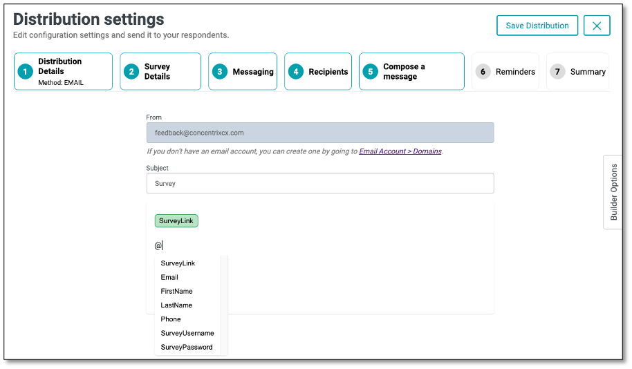
If you prefer composing your own message, start by entering a Subject. Next, begin typing your message in the body section. To insert a survey link, simply use the '@' symbol again and select the appropriate link. You can personalize your message by using the '@' symbol, which lets you insert dynamic fields such as the recipient's First Name, Last Name, Email, or Phone Number. The @ functionality pulls in the fields from the Single contact or Contact list under the Recipients tab. Once your message is complete, you have the option to save it as a template for future use.
NOTE: When using the @ function to insert variables from your contact list, the dropdown menu will display only the available variables from your list. Variables not included in the contact list, as well as username and password (if not enabled in the Survey Details tab), will not appear in the dropdown.
If a variable has a fallback value, its box will be highlighted in green. If no fallback value is set, the box will appear orange.
If you choose to add a button to your message, you can edit it after creation by clicking on the shaded area beside the button.
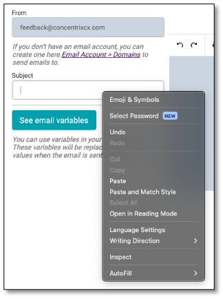
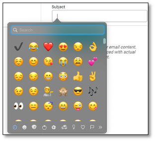
You can further customize your email subject line by adding emojis or symbols for added emphasis and personalization. Simply right-click in the Subject field and select "Emoji & Symbols" from the menu to insert icons that can help your message stand out in the recipient's inbox.
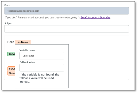
Fallback Function
Fallback** is a default value that is displayed when a personalized field inserted using the **@ symbol** (such as @FirstName or @SurveyLink) does not have a corresponding value in the Contact List. To set a fallback, insert the field using the @ function, then click on the field name and enter the fallback value in the pop-up menu.
This ensures that if data is missing, a default text will appear instead, helping to avoid blank or incomplete messages and maintain a smooth, professional experience for the recipient.
NOTE: You can customize the appearance of the survey link in the email invitation using the formatting toolbar, such as applying an underline or other styles to enhance its visibility. Similarly, for variables added with the @ feature, highlight the variable and apply the desired formatting. These changes will be reflected in the "Summary*"* tab.
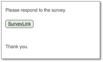
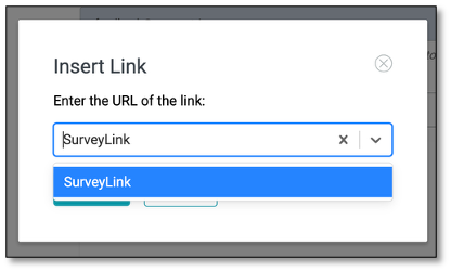
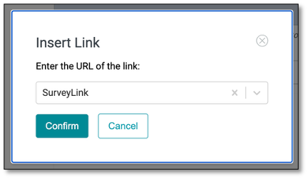
Applying Links to Custom Text in Your Survey
You can customize your text (e.g. Click here to take the survey) by selecting the 'Link' button from the Builder Options. Click the drop-down list to select the hyperlink, then click the Confirm button.
NOTE: Hyperlinking works only when applied to custom text. If you press the "Link" icon without highlighting text, the hyperlink will not be inserted.
Ensure the hyperlink is working in the live survey invite.
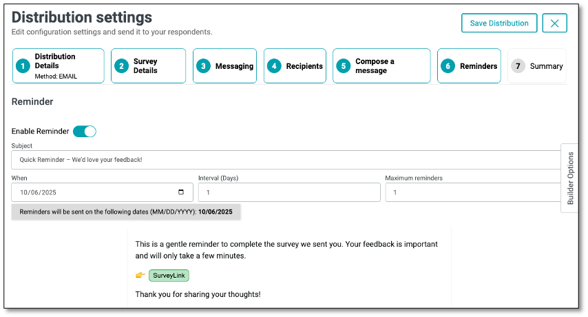
Once you've set up your email message, you can choose to send reminders to your survey respondents under step 6. In the 'Reminders' tab, you can configure automated follow-up emails for recipients who haven't completed the survey, specifying when the reminders will be sent and how often they should occur.
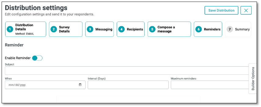
Enabling Reminders
The Reminder feature helps ensure higher survey response rates by automatically sending follow-up emails to recipients who have not yet completed the survey. Within the Recipients tab, you can enable and configure reminders to be sent at scheduled intervals, set the maximum number of reminders, and personalize the message. This feature provides a simple yet effective way to keep participants engaged and encourage timely responses.
NOTE: Ensure that all fields are completed, as each one is required to proceed.
Once enabled, you can configure reminder details:
- Subject: Enter a subject line for your reminder email.
- When: Choose the start date for when reminders should be sent.
- Interval (Days): Set how many days apart reminders will be sent.
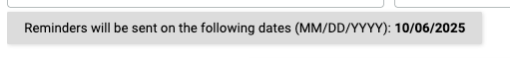
- Maximum Reminders: Define the maximum number of times reminders should be sent. Once the maximum number of reminders has been reached, no additional reminders will be sent.
- The message you create in the Reminder section will serve as the actual email content sent to recipients when the reminder is triggered.
NOTE: The reminder feature is available only when using the Email method and applies exclusively to Single type surveys.
The Builder Options feature provides tools to customize your email messages. Through the Templates panel, you can quickly create messages by choosing from ready-made default templates or reusing saved ones, helping streamline invitations, reminders, and follow-ups. If you wish to use the same template for both your initial message and your reminder, save your initial message as a template in Step 5 - Compose a Message, then select that template from the Templates panel in Step 6 - Reminders. You can further modify your reminder message if needed.
Additionally, the Appearance Options panel allows you to design and format your emails to match your branding by adjusting fonts, colors, alignment, and styles, as well as adding buttons, links, images, or dividers for better engagement and readability.
After saving, a Scheduled Reminder summary will display the configured settings.
Managing Reminders from the Distribution List
On the Distribution List page, all active campaigns are displayed in a table with details such as campaign name, type, creator, and schedule. Next to each campaign, you can click the ellipsis menu (⋮) to access additional options. From here, you can:
- Edit the distribution
- Stop Reminders
- End the Campaign
NOTE: The bell icon under the Reminder column indicates the reminder status of each campaign. An active bell means reminders are scheduled and will be sent to recipients, while an inactive bell means no reminders are set.
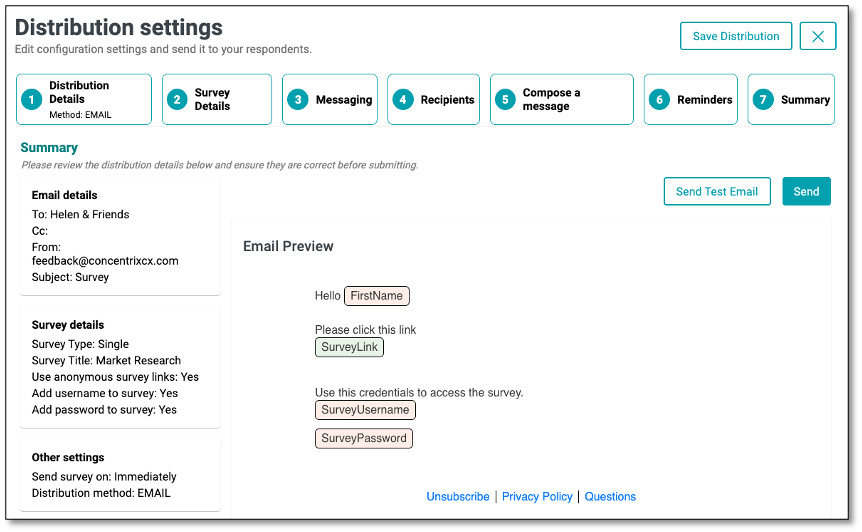
Select the 'Summary' tab to review your work. The "From" field should display the email account configured under the Email Account menu.
After completed, you can save this template or continue to step 7.
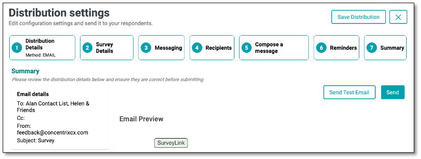
The Summary section provides an overview of key distribution details, including Email Details, Survey Details, and other relevant settings. This section serves as a final review point to ensure that all information is accurate and properly configured before sending out the survey for distribution.
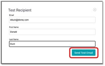
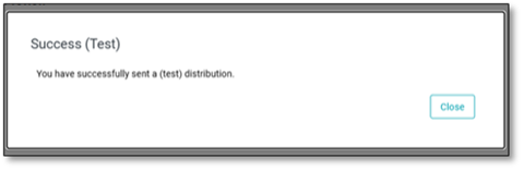
Now we can click on 'Send Test Email' to see the invitation in action.
To save, select 'Save Distribution'
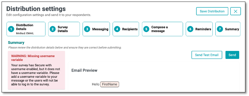
NOTE: This applies only to campaigns that have selected the “Secure with Username” option. If the required username shown in the Compose a Message tab is not included, a pop-up warning will appear in the Summary tab stating: “WARNING: Missing username variable.” Ensure all necessary details are completed before sending out the survey for distribution.
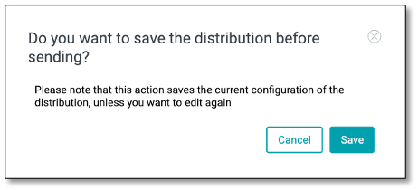
After completing all setup steps in the Distribution module, you can have the option to save your configuration by clicking the Save Distribution button in the upper-right corner. A confirmation pop-up will appear, allowing you to either save or cancel. Saving ensures that all details are preserved for future edits or use before sending out the survey.
Sending Out the Distribution
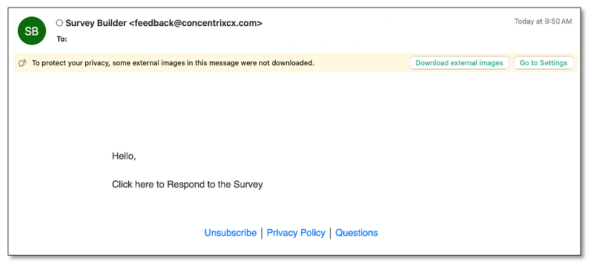
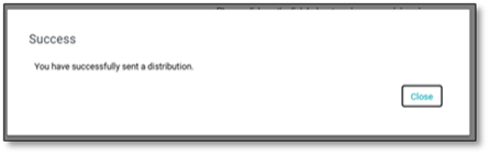
When you're confident that everything is ready to send to your contact list, select 'Send' button. Your invitation will be sent to your contact list, and respondents can start receiving your survey invitation.
When the invitation is received and the respondent clicks on the URL, they will be able to accomplish and complete the survey, the corresponding responses will be collected on the platform.
Distribution Dashboard
The Survey Distribution dashboard provides a summary of key performance metrics, email activity insights, and visual analytics to monitor your survey's progress and respondent behavior.
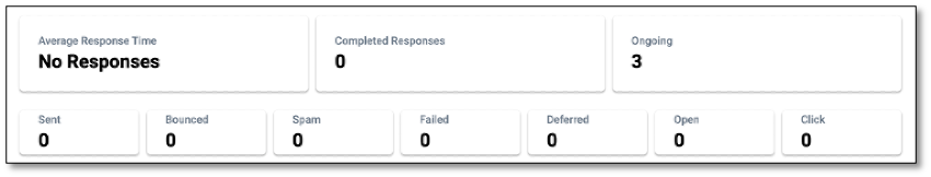
Metrics and Components:
| Metric | Description |
|---|---|
| Average Response Time | Displays the average time taken by respondents to complete the survey. |
| Completed Responses | Shows the total number of respondents who have fully completed the survey. |
| Ongoing | Displays the number of surveys currently in progress but not yet submitted. |
| Email Activity | Provides a breakdown of the email invitation performance: - Sent: Total emails sent. - Bounced: Emails that failed to deliver. - Spam: Emails flagged as spam. - Failed: Failed delivery attempts. - Deferred: Emails delayed for later delivery. - Open: Emails opened by recipients. - Click: Emails where the recipient clicked the survey link. |
Main Tabs
- Overview tab gives you a quick summary of key metrics like completion rates, engagement levels, and response patterns.
- Analytics tab offers visual insights with charts, graphs, and word clouds to help you interpret results at a glance.
- Respondents tab allows you to drill down into individual participant data, view responses, and manage respondent information.
NOTE: For detailed descriptions and sample screenshots of the main tabs, please refer to the explanations provided in the Survey Dashboard pages.
Understanding Survey Management Functions
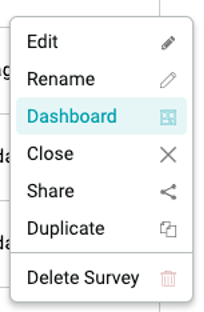
This drop-down menu provides quick access to essential survey actions, from editing and renaming to sharing, duplicating, and deleting. Each function is designed to help you efficiently manage your surveys and streamline your workflow.
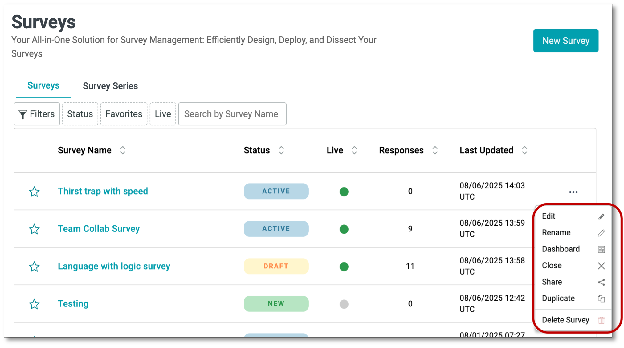
- Edit -- Opens the survey in the Designer mode, allowing you to modify questions, layout, and settings.
- Rename -- Updates the survey name to a new name of your choice.
- Dashboard -- Displays the survey's reporting dashboard, including analytics, metrics, and response summaries.
- Close -- Marks the survey as closed, preventing any further responses.
- Share -- Provides options to generate and copy the survey link for distribution.
- Duplicate -- Creates an exact copy of the survey, which can be edited or repurposed.
- Delete Survey -- Permanently removes the survey from the system and cannot be undone.
Analyzing Survey Results using Dashboard
To gather your data, navigate to the menu icon at the top left of your screen. Select the Surveys tab.
To view the results, you have two options to access the survey dashboard:
- Go to the Survey Builder menu and select Surveys from the drop-down list to access the list. From there, click on the survey name to be taken directly to the survey dashboard
- Navigate to the far right of the survey and select the ellipsis icon (the three vertical dots). After you have selected the ellipsis icon (the three vertical dots), select the 'Dashboard' icon. This will bring you to the results of your survey.
NOTE: This Dashboard view lets you see all results associated with a particular Survey, regardless of which Distribution was associated with the data. Any changes made in this dashboard will not affect the Distribution Dashboard views
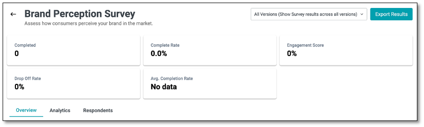
Survey Dashboard
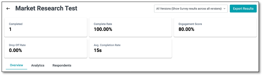
The Survey Dashboard provides a comprehensive view of your survey's performance and responses. It is divided into three main tabs---Overview, Analytics, and Respondents---each designed to help you monitor participation, analyze feedback, and review individual responses efficiently.
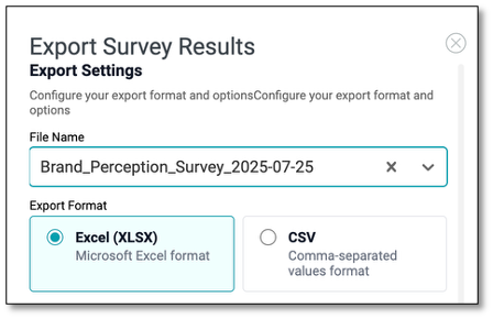
The Metrics displayed at the top offer a quick summary of survey performance. Additionally, the Export to File feature allows you to download survey results in a customizable format for further analysis or reporting. You can configure export settings, select the data types to include, and choose the file format that best suits your needs.
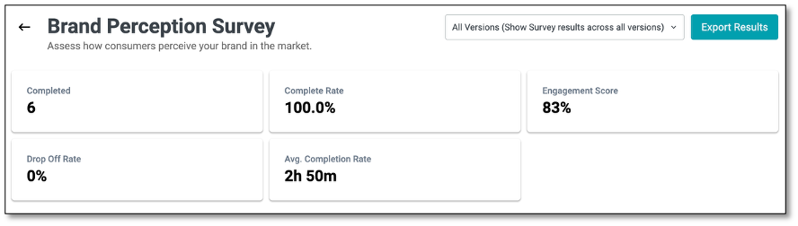
All Version (Show Survey results across all versions)
At the top right of the page, you'll find the All Versions option. Selecting this ensures that responses from all survey versions---whether participants completed the original or any updated version---are included in the results.
This feature allows you to view and export data from all published versions created through the Draft and Publish process. It is especially useful when you need a comprehensive dataset that consolidates responses across every iteration of the survey for analysis or reporting purposes.
Main Tabs
- Overview tab gives you a quick summary of key metrics like completion rates, engagement levels, and response patterns.
- Analytics tab offers visual insights with charts, graphs, and word clouds to help you interpret results at a glance.
- Respondents tab allows you to drill down into individual participant data, view responses, and manage respondent information.
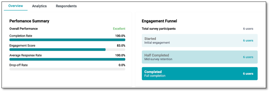
Overview Tab
The Overview tab provides a high-level summary of your survey's performance and engagement metrics. It gives you quick insights into how respondents are interacting with your survey.
Key Components:
- Performance Summary: Displays overall metrics such as Completion Rate, Engagement Score, Average Response Rate, and Drop-off Rate, with visual progress bars for easy interpretation.
- Engagement Funnel: Shows the total number of survey participants and tracks their progress through stages: Started, Half Completed, and Completed.
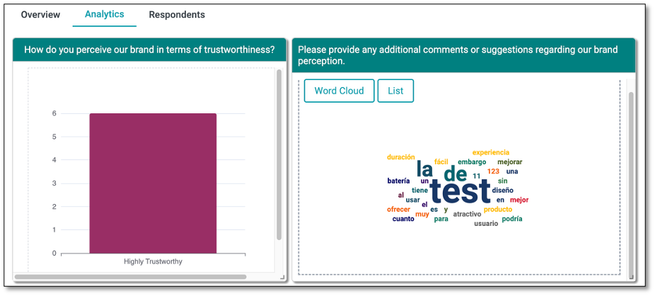
Analytics Tab
The Analytics tab presents detailed data visualizations of your survey responses to help you analyze trends and insights. It allows you to view survey responses through various visualizations such as bar charts, line graphs, and pie charts for each survey question.
For open-text responses, a word cloud highlights the most frequently used words, making it easy to identify common patterns and themes. You can also switch to a list format to see a detailed breakdown of individual open-text feedback for deeper analysis.
Under the Settings icon (represented by the gear icon located within each chart), you can configure chart layouts and options. Choose vertical or horizontal orientation, toggle titles and legends, and adjust margins for alignment. Set your base field (e.g., "Choice" or "Value"), select chart types and colors, and customize axes with labels, intervals, and scaling. Advanced options let you add series labels, define color logic, and choose between column or row layouts for clearer data visualization.
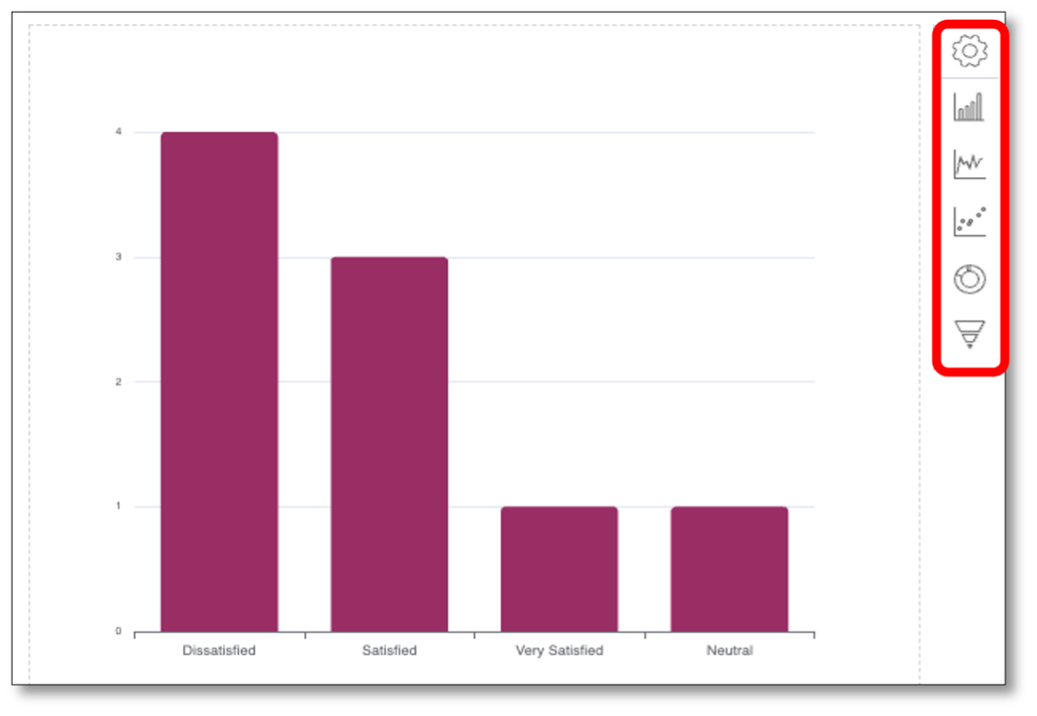
When you click on the Setting icon, you will be directed to a panel where you can further customize your chart. It provides a range of options to control chart layout, appearance, margins, data configuration, axis behavior, and advanced styling. By adjusting these components, you can create clear, meaningful, and visually engaging charts that best represent your survey data.
Components of the Analytics Tab -- Under the Settings Icon
Chart Subtype
Vertical / Horizontal Orientation: Choose between vertical or horizontal chart layouts to best represent your data.
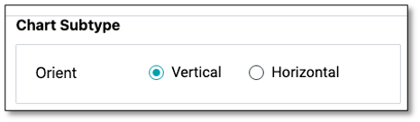
General Options
- Show Title: Toggle to display or hide the chart title.
- Show Legend: Enable or disable the legend to indicate what each color or bar represents in the chart.
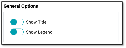
Margin Options
- Adjust margins (Top, Right, Bottom, Left) around the chart for better spacing or alignment within the report view.
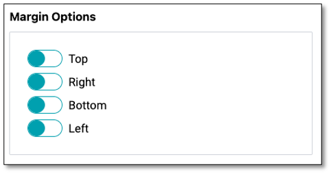
Data Options
- Base Field: Select the field from your dataset (e.g., Choice) to use as the basis for your chart.
- Choice: This option uses the response categories or answer choices from a survey question as the base for the chart.
- Value: This option uses the numerical or calculated values associated with responses as the base for the chart.
- Series Type: Choose between Value (numeric data) or Time (time-based series).
- Chart Type: Select from available visualization styles such as bar, line, or pie charts.
- Color Picker: Customize the chart color for better visual distinction.
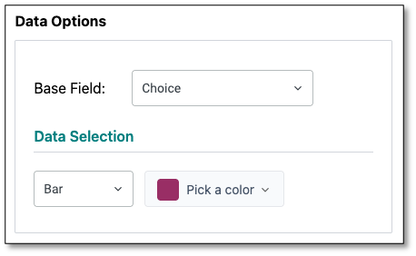
Axis Options
X Axis & Y Axis: Configure axis settings individually.
- Axis Type: Select the axis type (e.g., Category, Value).
- Axis Name: Toggle to display axis names.
- Max Value & Interval: Set the maximum value and define intervals for better scaling.
- Custom Axis Label: Enable to rename axis labels for clarity.
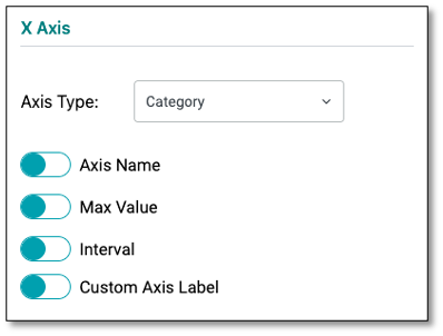
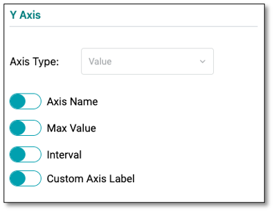
Advanced Options
- Series Labels: Turn labels on/off to display values directly on the chart.
- Color By: Define coloring logic (by series or by data).
- Series Layout: Choose between Column or Row layouts for grouped or stacked data visualization.
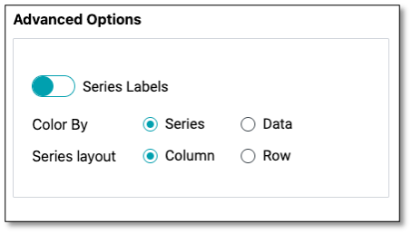
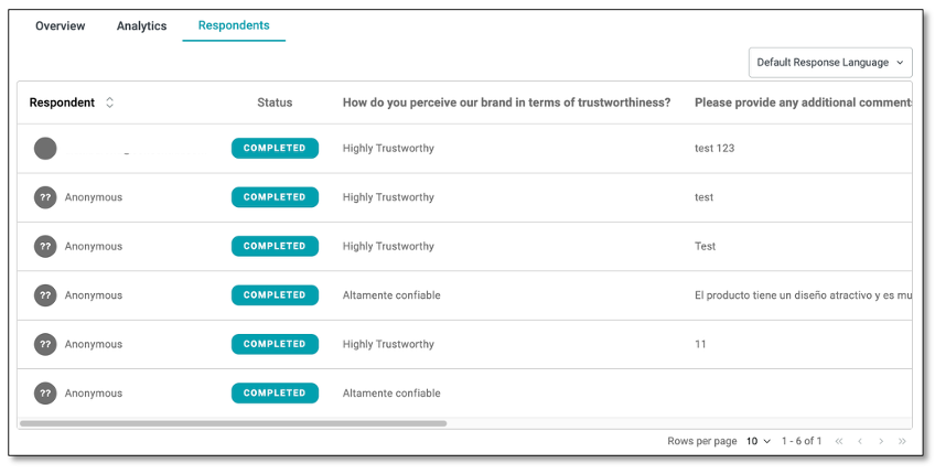
Respondents Tab
The Respondents tab provides a respondent-level view of survey data, allowing you to see individual answers, response statuses, and the time each respondent took to accomplish the survey.
Key Components:
- Respondent List: Displays each participant's email (if available), their completion status, responses to each question, and the time it took them to complete the survey (Response Time).
- Default Response Language: Lets you translate responses into a different language for easier review or revert to the original language in which the survey was answered.
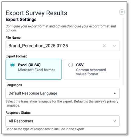
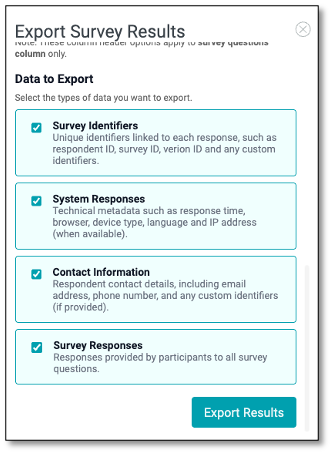
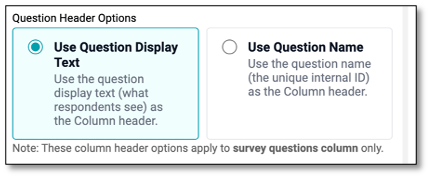
Export Results
The Export Results feature allows you to download survey results in a customizable format for further analysis or reporting. You can configure export settings, select data types to include, and choose the file format that best suits your needs.
Navigating Export Settings
In the Export Settings, you can specify the file name (auto-generated but editable), choose a format like Excel for easy viewing or CSV for lightweight data handling, and set the default response language to translate or keep responses in their original language. You can also filter which responses to include based on their status, such as all responses or completed only.
- File Name: Specify the name of the export file. A default name based on the survey title and date is auto-generated but can be edited.
- Export Format: Choose your preferred file format:
- Excel (XLSX): For easy viewing and manipulation in spreadsheet tools.
- CSV: For a lightweight, comma-separated values format compatible with most data systems.
- Languages: Use the Default Response Language dropdown to select the language for export. This lets you translate responses into a chosen language or keep them in the original survey language.
- Response Status: Filter responses to include in the export (e.g., All Responses, Completed Only, etc.).
Navigating Data to Export
- Survey Responses: Includes participants' answers to all survey questions.
- System Responses: Exports technical details like response time, browser type, language, and IP address (if available).
- Contact Information: Adds respondent details such as email address, phone number, and custom identifiers (when provided).
- Survey Identifiers: Includes unique identifiers like respondent ID, survey ID, version ID, and any custom fields.
Question Header Options
- Use Question Display Text Displays the full question text (what respondents see) as column headers.
- Use Question Name Displays the internal question ID as column headers.
Once all options are configured, click Export Results button to generate and download the file.
Sample Raw Data File
The color-coded raw data file contains detailed information, including survey responses, system responses, contact details, and survey identifiers. This comprehensive dataset can be used for further analysis and reporting.

Translation Module
The Translation Module is a configurable component that allows administrators to add and manage languages available for translating the content of survey questionnaires. This module enables multilingual support, ensuring that surveys, feedback forms, and applications can be presented in different languages based on respondent preference.
The DIY Survey Builder provides two ways to offer multi-language support, giving respondents flexibility in choosing their preferred language.
Language Selection Question (In-Survey Dropdown)
- Enables respondents to select their preferred language before answering the survey questions.
- When you want to ensure every respondent actively selects a language, especially if the default language may not match with their preference.
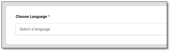
Language Switcher (Top-Right Dropdown)
- Allows respondents to switch the survey language at any time during their participation.
- To provide flexibility for respondents to change their language preference while navigating through the survey, or if they miss selecting it initially.
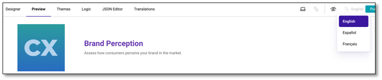
NOTE: To send messages in multiple languages using the Distribution -- Compose a Message tab, users must source translations outside the platform and manually add them to the message area.
How to add the Language Selection Question in your survey
To add a language selection to your survey, drag the Language question type into your survey---ideally as the first question.
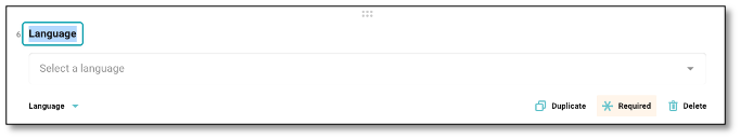
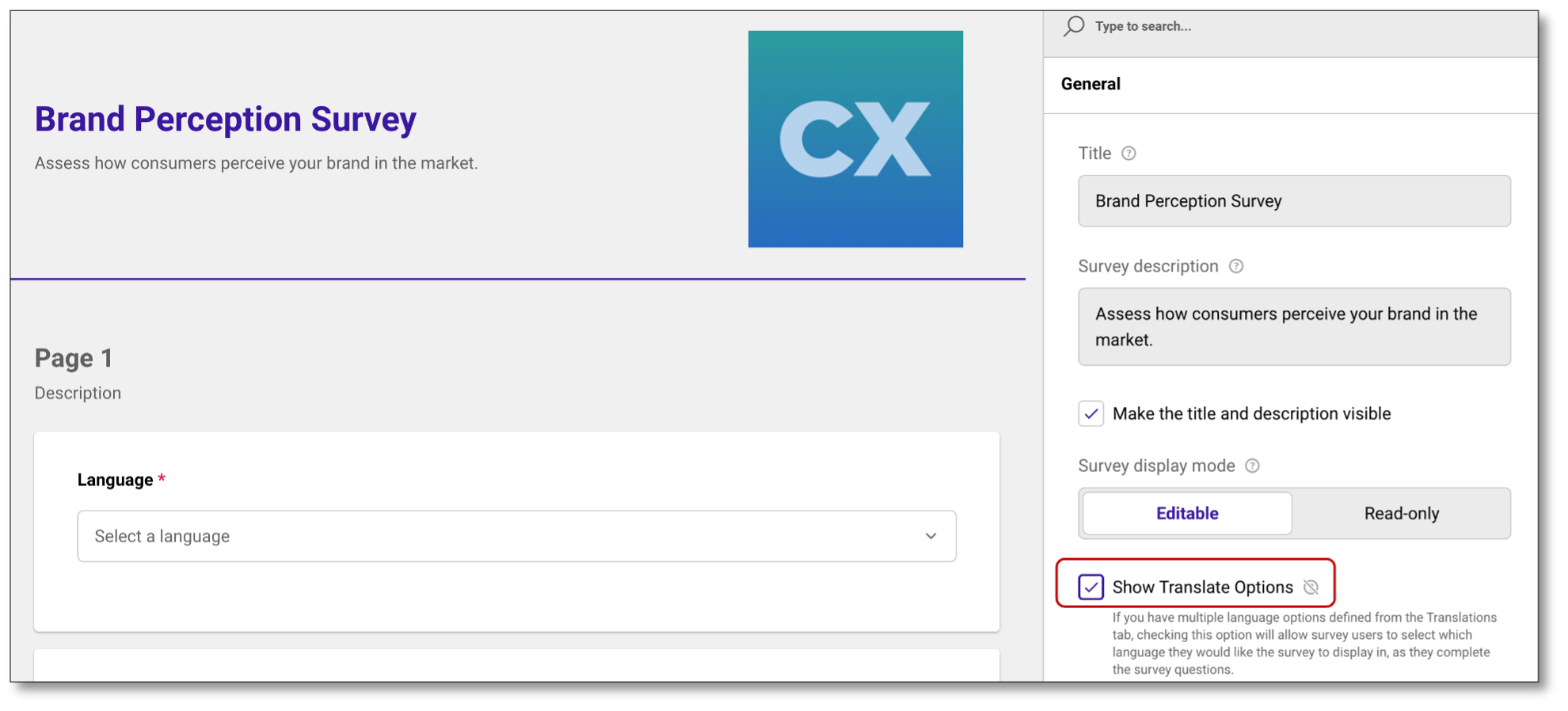
Under the Survey Properties - General panel, make sure to enable Show Translate Options to allow respondents to choose their preferred language for completing the survey.
NOTE: You need to update the question text as this is required to publish the survey.
Proceed to the Translation Module to set-up the language/s you will add.

To add a new language, click the plus (+) icon and choose a language from the dropdown. The selected language will appear next to your default language.
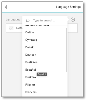
To auto-generate translations, click the Auto-translate icon (next to the trash bin). In the pop-up, click Auto-translate All located on top and click the Apply button below.
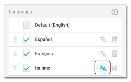
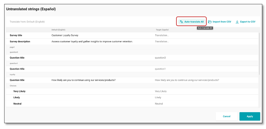
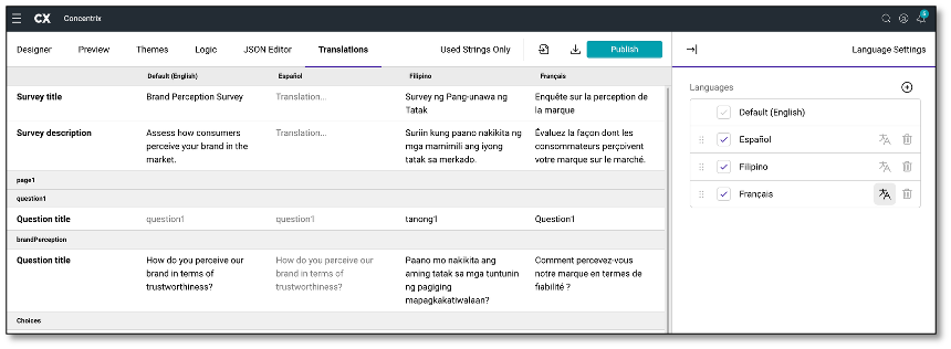
Repeat this process separately for each language you wish to translate. Once applied, the page will display the translated survey questions, allowing you to review and compare them with the default language. If there are words that do not translate correctly into other dialects, users will need to manually adjust the translations as needed.
If any wording is modified in a question, choice option, or title that has already been translated, or if new questions are added after the initial translation, users must update the translation to reflect these changes.
To do this, go to the Translation Module, delete the existing translation (if applicable), re-select the target language, and run the Auto-Translate process again. This ensures all recent edits and additions are accurately captured in the translated version.
When a language is added via the Translation Module, it becomes available for respondents. The Language Selection question will appear as a dropdown in the live survey, allowing respondents to choose their preferred language. The survey content will then display based on the configured translations.
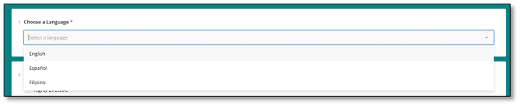
NOTE: In Preview mode, the language options for this question type will not appear. However, when accessing the live survey link, the dropdown will display the languages that have been enabled in the Translations module.
The Language Selection Question displays in English language by default. The survey content will only switch to another language once the respondent chooses their preferred option from the dropdown menu.
An alternative way to translate the survey is by using the Language Switcher located in the top-right corner of the Preview page. To verify your setup, click the Translate icon in this section to view and test the configured language options.
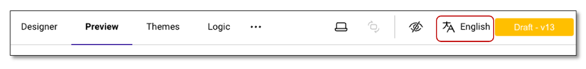
NOTE: The Language Switcher displays all available languages that have been configured in the Translation Module, allowing respondents to change the survey language at any time.
Language Switcher (Top-Right Dropdown)
- Allows respondents to switch the survey language at any time during their participation.
- To provide flexibility for respondents to change their language preference while navigating through the survey, or if they miss selecting it initially.
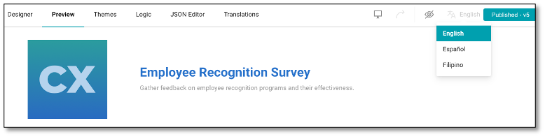
NOTE: To send invitations in multiple languages, create a separate contact list for each language, ensuring that it contains only recipients who should receive the invitation in that specific language. Then, set up a separate distribution for each language and select the same survey from the "Select a survey" dropdown under Survey Details.